Target // Special Projects
Over the course of my 8 years with Target, I was stretched to a lot of additional side projects + initiatives. These moments always reminded me how highly-skilled I am in what I do, being chosen + trusted to lead so many additional incremental projects, but also made me feel seen + valued on the team. Some of these initiatives were very analytical and process drive, where as some were more focused on my visual merchandising expertise + leveraged my creative side. I’ve highlighted some of these more analytical/process/number driven projects on the Key Capabilities page. This page focuses more on the visual + creative Special Projects! Below you will see a handful of examples of different Family Gateway curations I merchandised while on the Apparel + Accessories team. Then you will see 2 different examples from my time on the Home business: some work during my time on the Disney Shop for Target space (select stores initiative) and a rendering exercise I lead focused around communicating to Merchants + Leaders how to shift perspective on our asset usage to better simplify to amplify. All of the below examples were projects I had fun doing, and I think the outcome of work you enjoy makes the final product that much better!
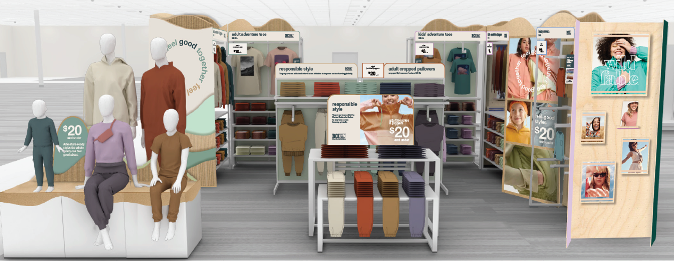
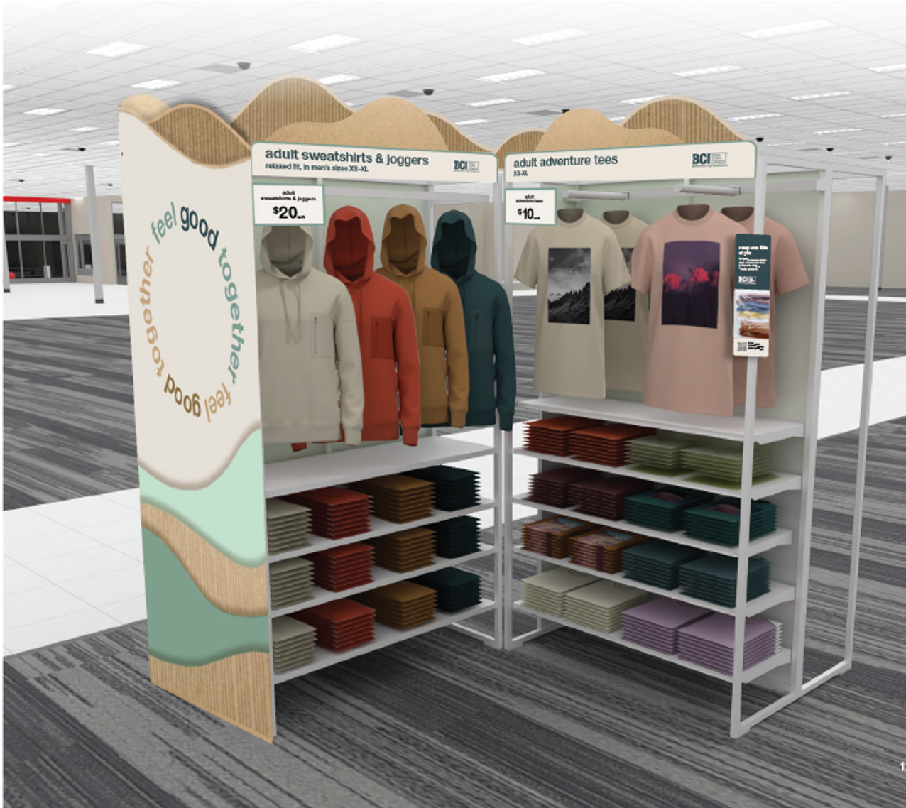
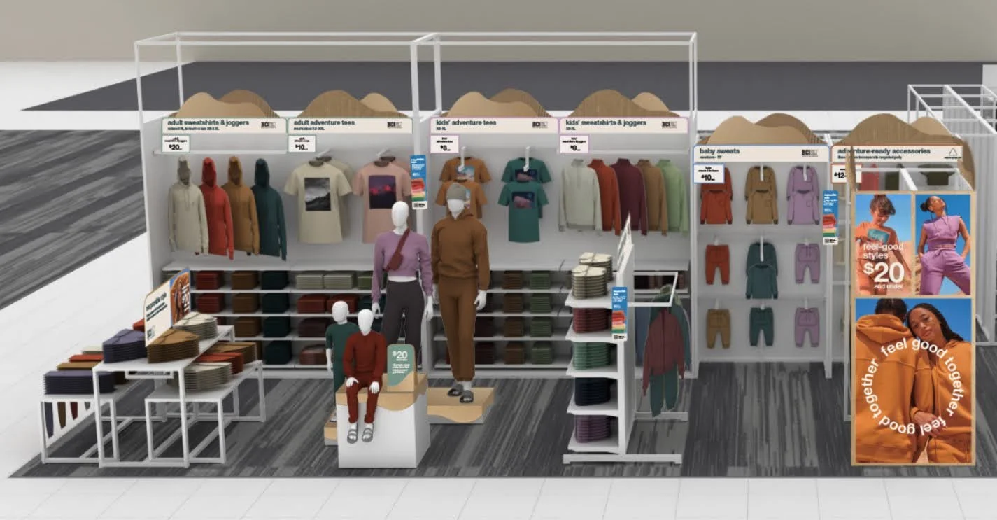
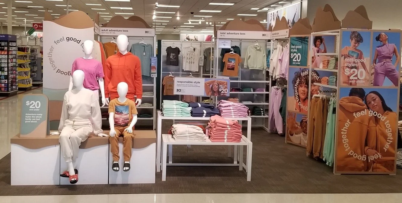
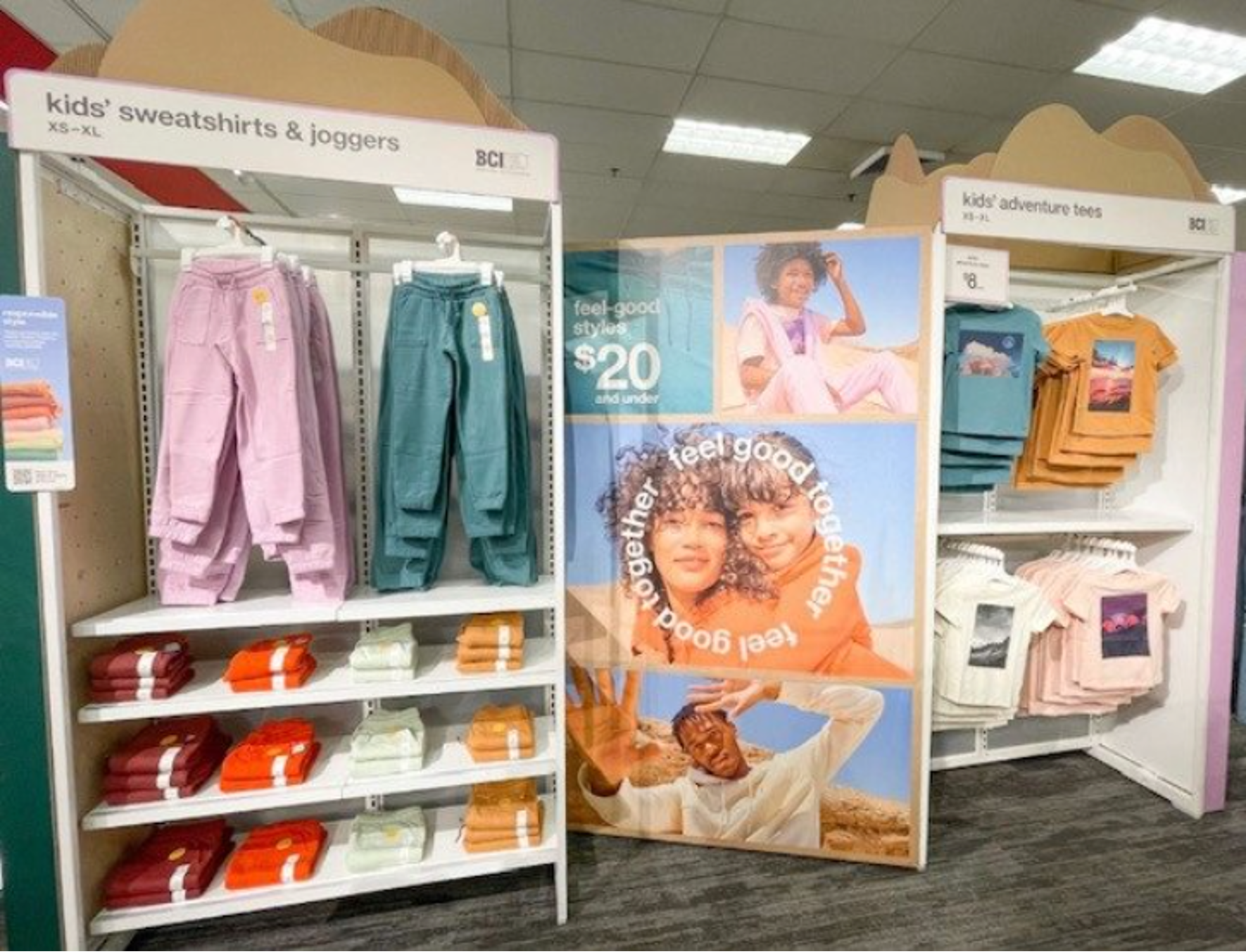
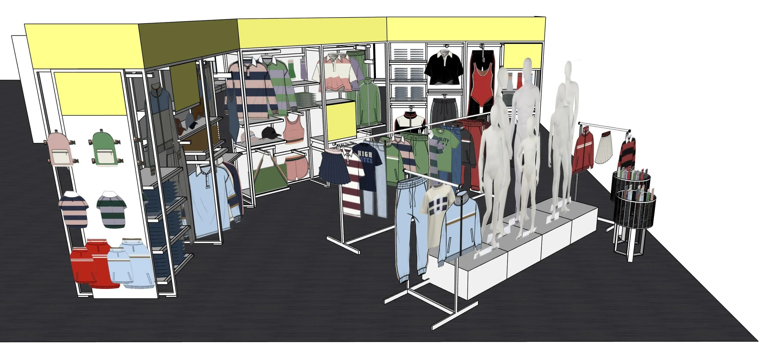
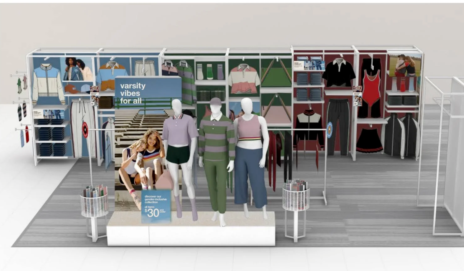
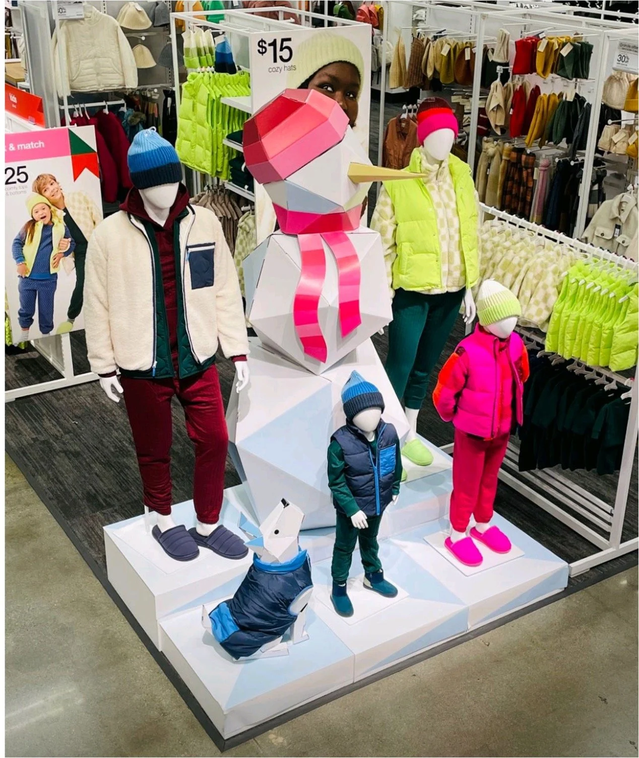
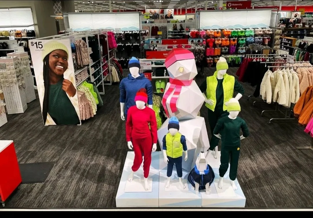
Family Gateways…
When Visual Merchandising first got integrated into the working streams at Target, we were focused solely on getting the existing floorpads + brands up + running on Visual Merchandising assistance, creating brand standards, determining what visual training tools stores needed, and getting store teams trained and to a place where they knew how to leverage the tools we were creating. Once we got to a good place with teaching + training, set + workload flow evening out, and a sustainable business model for stores, we were able to then shift gears into optimizing + maximizing guest experiences. Part of that shift in focus was right-sizing brand shops + overall A&A floorpad flows, to take into account the overall guest journey + guest insights feedback. In shifting some things around + right-sizing the spaces, we were able to un-lock a space for what is now known as the “Gateway”. Since Target stores do not have Window Displays to advertise newness or curate storytelling to the outside world, as a marketing tool to pull guests into the store… we needed a way to curate within A&A and draw more guests in to shop more of our store. This Gateway space was the perfect opportunity to create a faux-window, not as a window to the store, but a window to newness + seasonal celebrations within A&A. This floorpad space would be designated to pulling together brands and items not just across A&A, but at times Home, Hardlines, Entertainment, Beauty, and even F+B (food + beverage) to better curate full-store + full-family moments. This Gateway quickly became known as the “Family Gateway”, as it was a place to bring the full family together, trends or seasons that spoke to every member (even at times included items for pets!) and encourage cross-shopping as well as inspire the guest to discover more!
Because this was a floorpad that would be ever-changing (with respect to what items, categories, + brands would land in it)… and it was quick-changing (more frequently than our normal cyclical work)… this space would update often + require high-touch + shorter timelines for execution builds. This was considered an incremental space the Visual Merchandising was supporting, while we figured out frequency + support need, and because of this newness in scope + process, there was not one specific parter attached to the space. Therefore, Visual Merchandising partners were tapped to lean-in each set based on their bandwidth with their other businesses + as-needed to tackle the work. Due to my efficiencies + expertise in Visual Merchandising, as well as great partnership building with my core-CFT, I was able to balance my already high cyclical work and stretch to work on the Family Gateway often. After ping-ponging which Visual Merchandising Business Partner was over the Family Gateway each set, and realizing the inefficiency that came with getting new partners grounded in the space’s fixture package limitations + door count/ segmentation nuances, etc each time, the team eventually decided to have 1 partner oversee these builds set to set. I was fortunate to be named that partner. Below you will see all of the Family Gateway sets that I was a lead cross functional partner for + lead VM decision making at the gateway roundtable for. All of the below examples were fully merchandised by me, and some of the cross-merchandising decisions were made based on my influencing + suggestions to round-out storytelling!
2021:

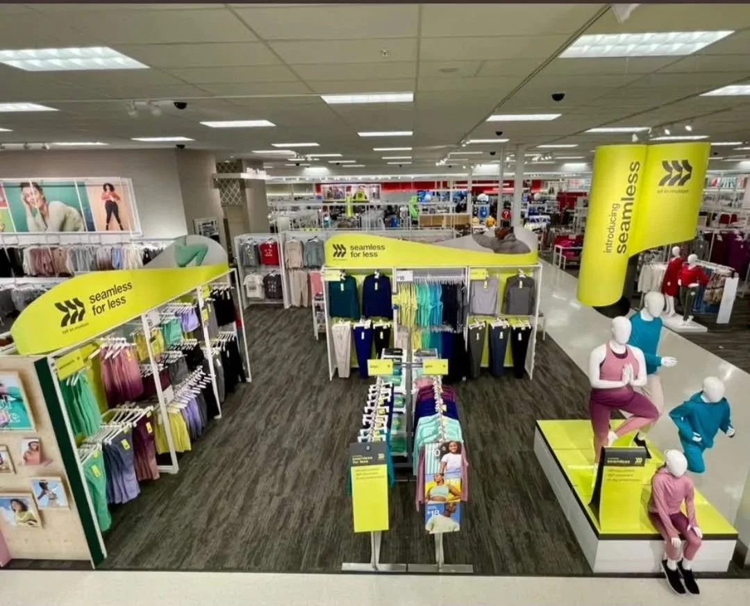
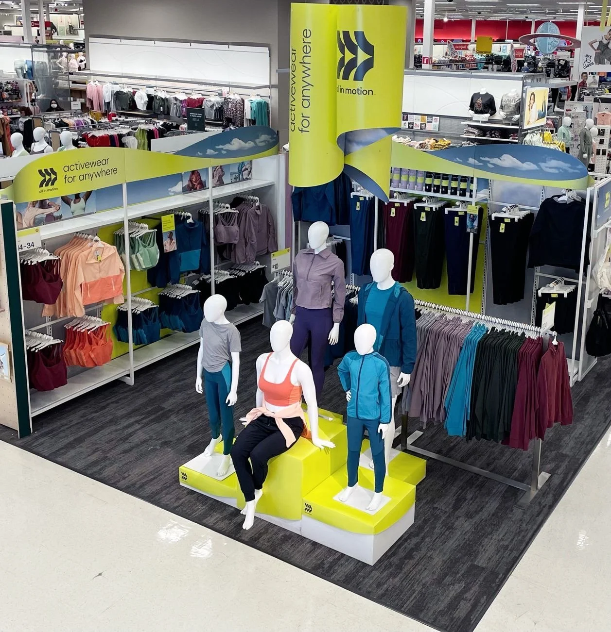
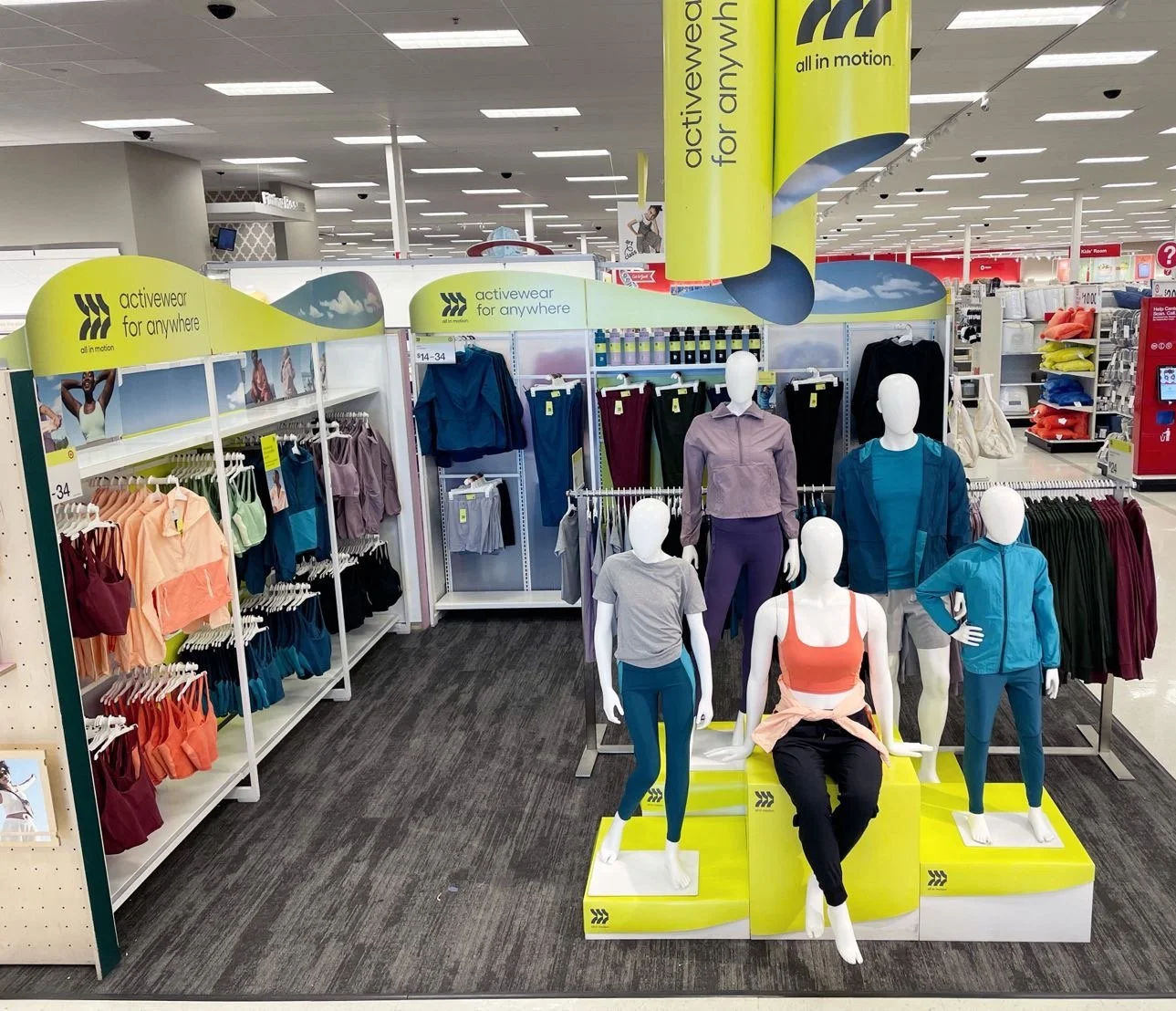
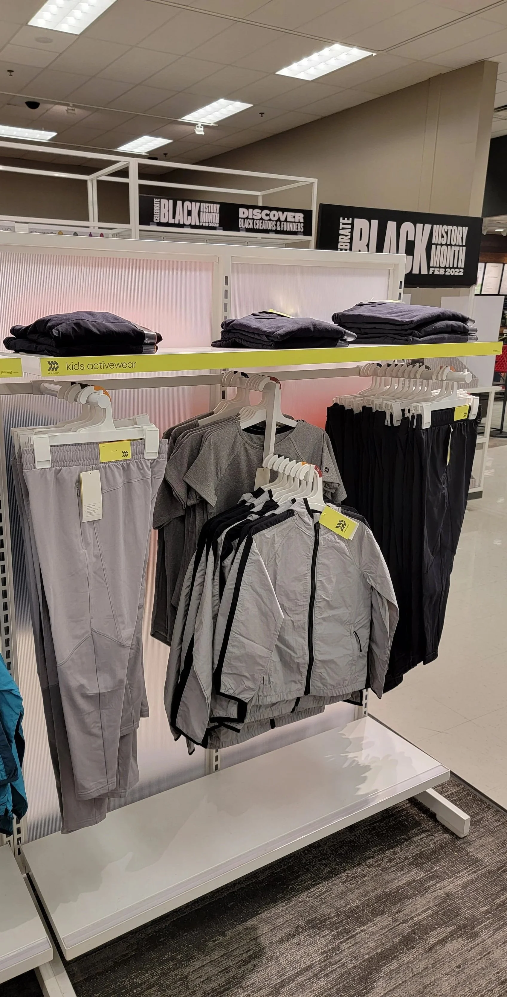
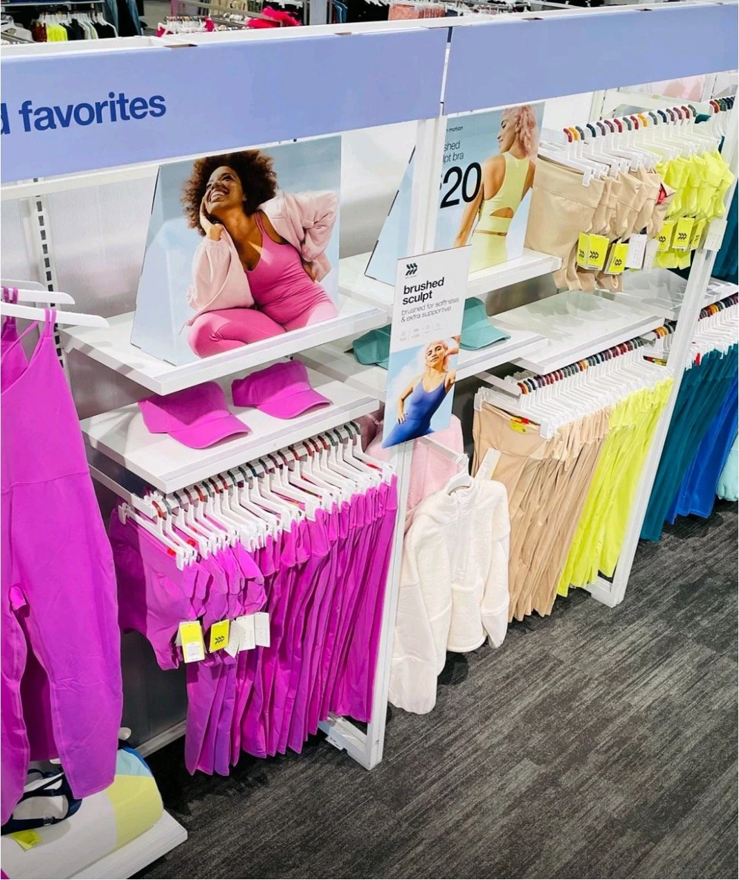
All In Motion Seamless Collection


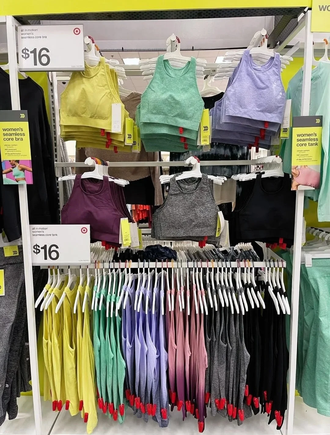


store execution:


social buzz:


Modern Essentials


Modern Essentials 2.0 refresh


store execution:


social buzz:


2022:

All In Motion Tonal Dressing


store execution:


social buzz:


Hometown Heroes


store execution:


social buzz:


Winter Whimsy

store execution:


social buzz:


2023:

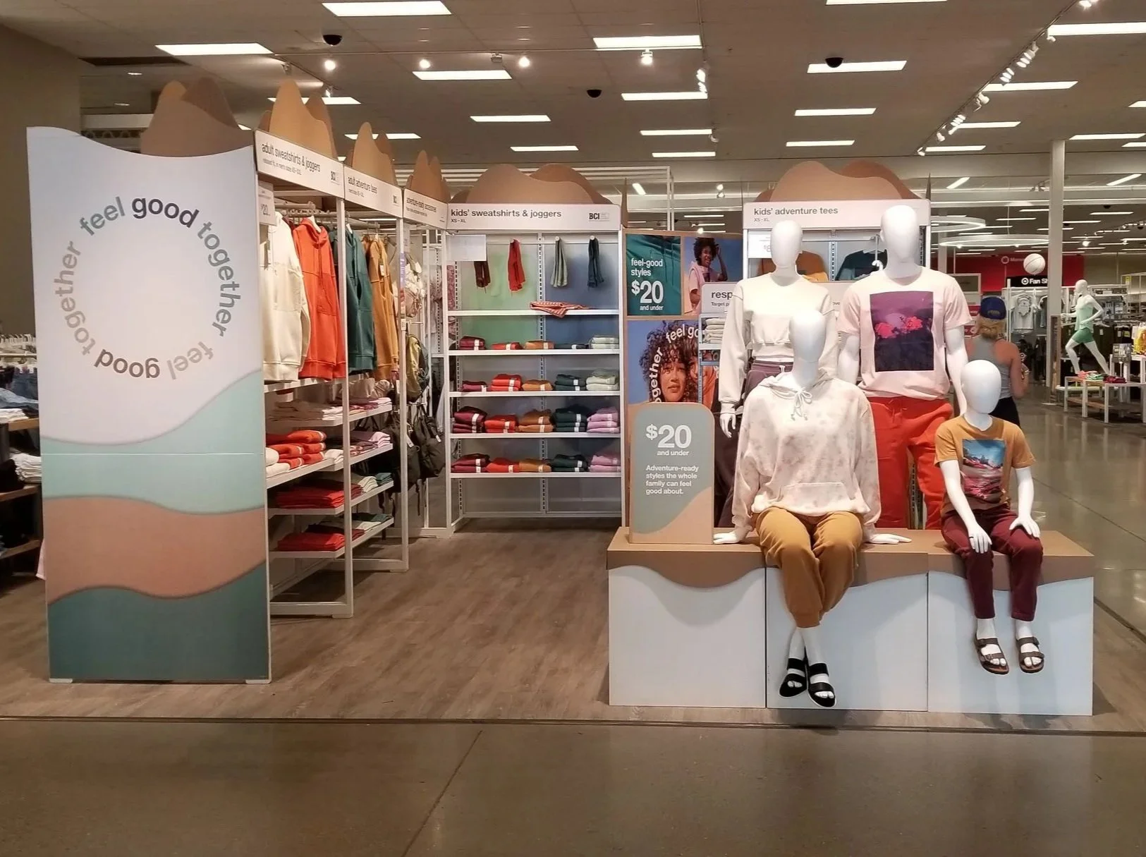
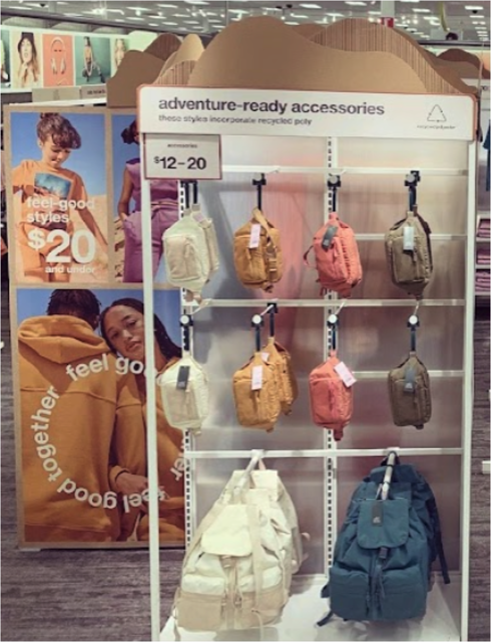
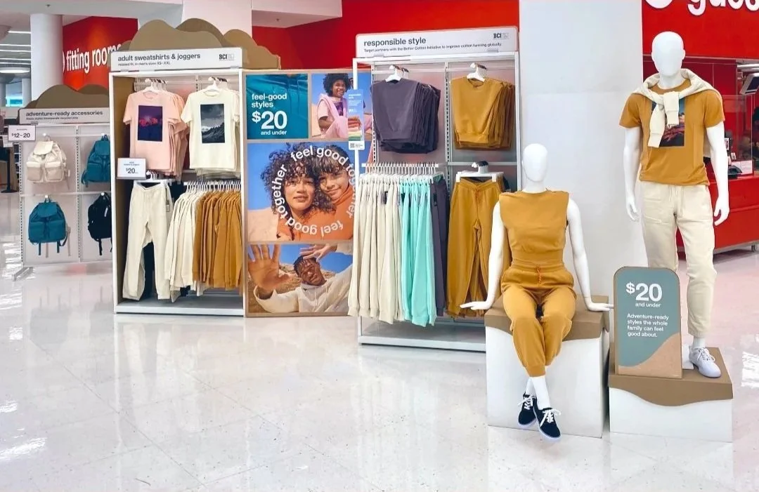
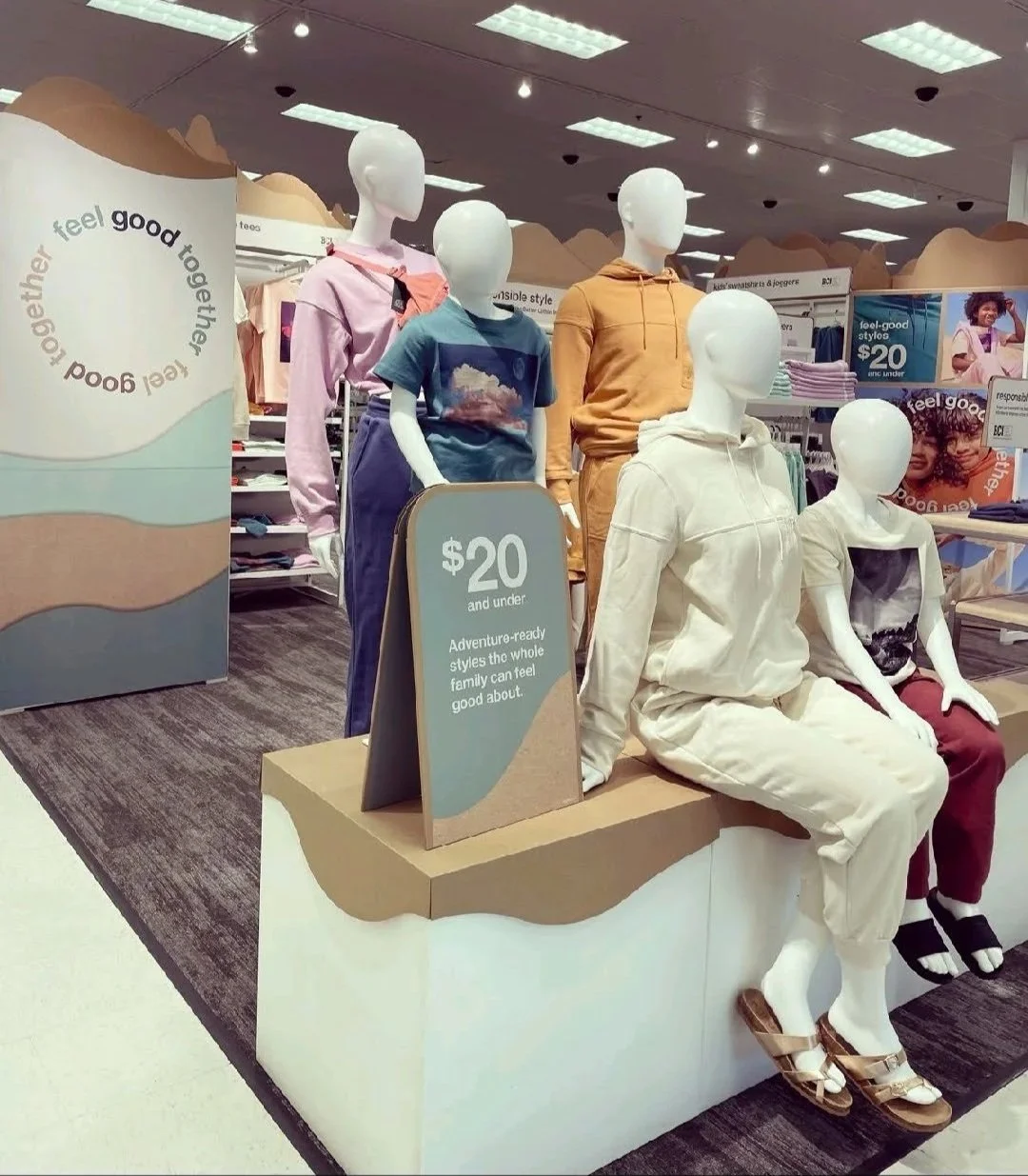
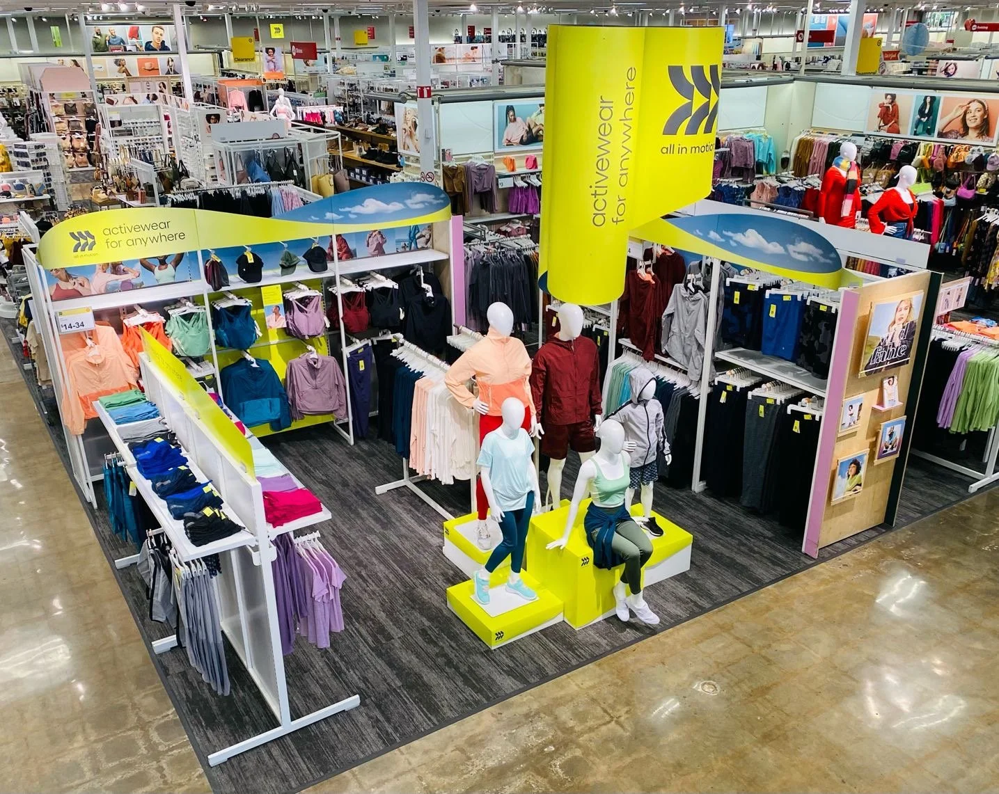
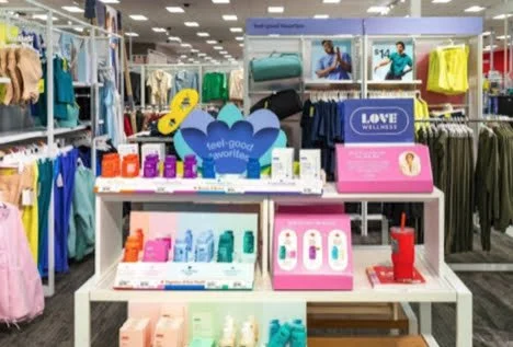
All In Motion Wellness


store execution:

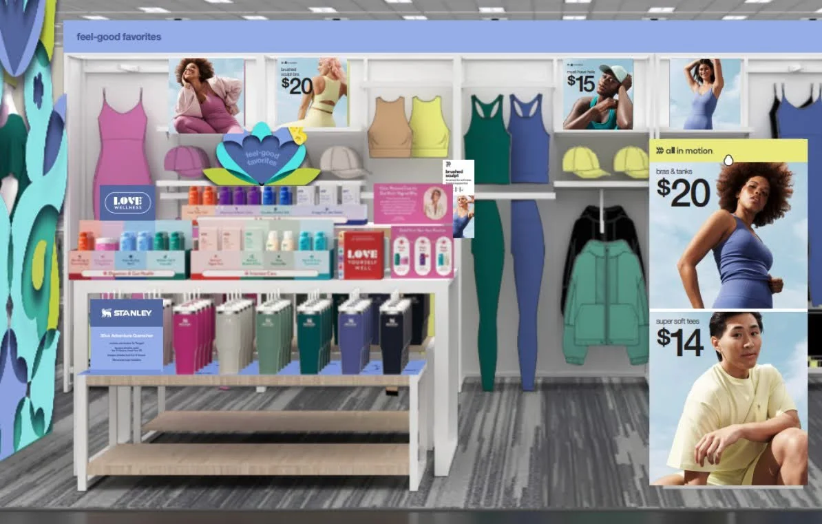
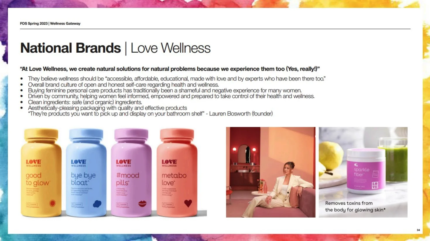


store execution:


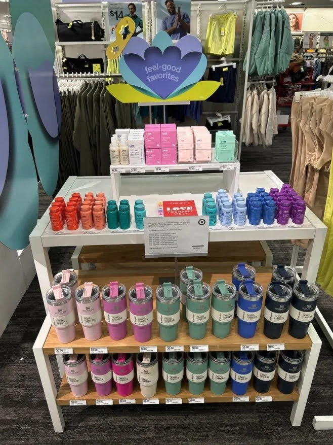
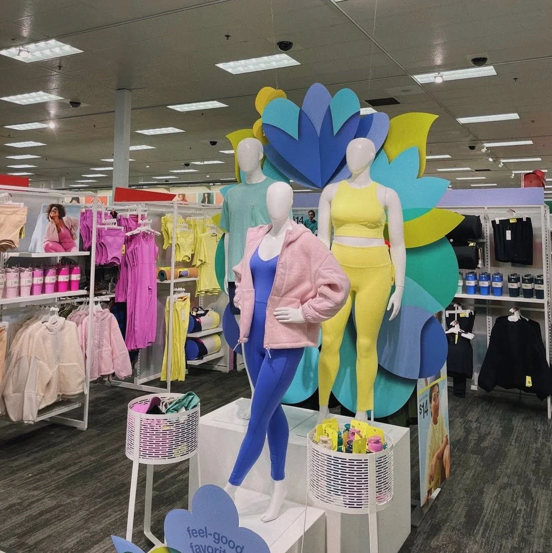

social buzz:


Valentine’s Love


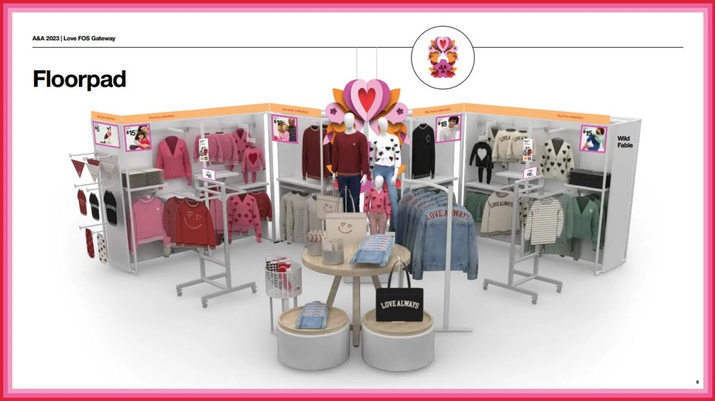


store execution:


social buzz:


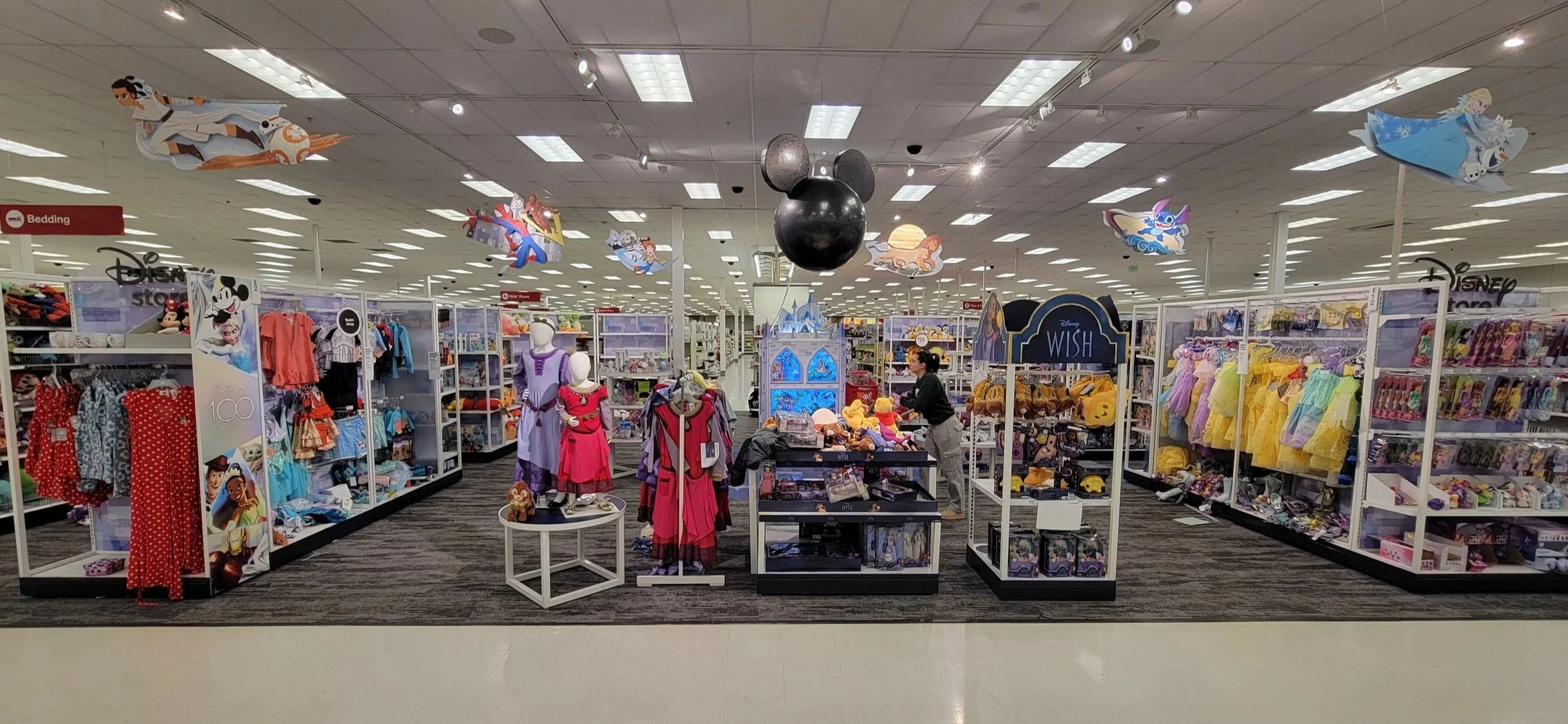
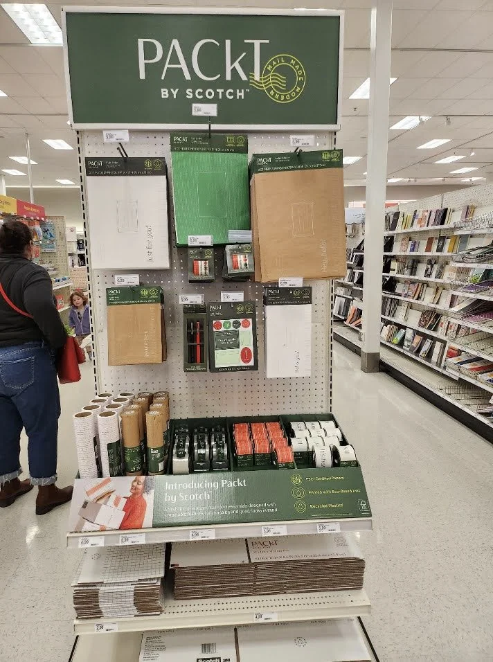
Disney Shop …
This was an interesting stretch project. When I joined the Home team, Visual Merchandising had started supporting the Disney Shops. Only select Target stores have this Disney specific carved out shop, so this was a select-door initiative. But even though it was not all doors, it still needed support to ensure these stores could set this space accurately. The Disney Shop was a mix of curated storytelling fixtures (owned by VM) and regular POGged spaces (set by plannograms). I joined the Disney Shop CFT to better influence how VM + SPT work together in curating more of the space and having synergy between our teams for the shop to feel visually cohesive, even if a Visual Merchandiser was not making merchandising decisions for every fixture. There was a lot of coaching, guiding, and influencing involved in this project, as well as teaching + training SPT partners on visual basics like color-flow, size + scale, low-to-high merchandising, etc. For the VM owned fixtures, I then concepted out what storytelling possibilities we could have in the space, to pitch ideas to the Merchants of how zoning could flow within the shop. Not all of these ideations became reality, but it was fun to explore different ways-in + curation options that we hadn’t done in the space before. Below you will see only a couple of those storytelling concepts + sketches.


Value Projection Sprint …
This was another project I was tapped for while on the Home team. In Target stores there are a lot of Endcaps, these are aisle-facing ends of Gondola runs that measure either 3ft or 4ft in width + tell product moments/stories for quick-gets for the guests. Ultimately, we know the guest spends less than 3 seconds looking at an Endcap, so in order to capture a guests attention for this space and cause them to stop + stay longer or even shop these spaces, we need to be bold + authoritative— whether that is with Price, Category, or Color. “Simplify to Amplify” was the buzz statement at Target HQ for a while, because we knew we were losing guest’s attention and product submissions throughout the store were getting muddy. Because of this, there was a Sprint Project pulled together. The intent of this project was to “sprint” and quickly render out examples of what we mean when we say Simplify to Amplify. Taking existing programs/submissions that live in-store today + showcase how we could be doing a better job communicating these to the guest — whether that is by setting them on different fixtures, breaking them apart by different storytelling, or editing the assortment + price variations. For this work, I was given a handful of different pre-existing sets and asked to Simplify to Amplify them.
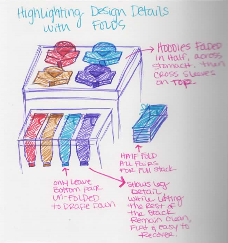
In some cases, that was just editing to less items with more facings of each item to lean into the “Fewer, Deeper, Bolder” mentality so that presentations did not break as quickly and we could stay in-stock for the guest to see the story being told + shop it for longer than a day.
In some cases, this was taking 1 Endcap of a lot of stuff, and showing what it would mean if that 1 Endcap of an overwhelming amount of things actually became 2 cleaned up Endcaps with less items, possibly driven by Price to further express Value to the guest.
In some cases, this meant taking a pre-existing assortment + re-merchandising it on different fixtures, whatever fixtures I thought would be most appropriate to communicate the assortment to the guest… sometimes that was amplifying a seasonal story on a Focal, sometimes that was taking over a Focal and Endcaps for a bigger statement, and other times that was showing it on our in-aisle Enterprise Fixtures (carts + towers) to be more short-lived + disruptive.
All of these explores not only helped visually represent the power + overall positive impact we could achieve, not by starting over or omitting existing assortments, but rather changing our approach to how we show up to guests, but it also helped unlock this “Simplify to Amplify” phrase for partners who couldn’t visually see it for themselves without the examples to help bring this to life. This exploration lead to an overwhelming response from higher-up leadership, which then lead to some guardrails being put into place for submissions + fixture allocations, and in-turn lead to a pivot in approach and an immediate put into action adjustment requirement for all teams. There was a broad shareout + training with all teams from Merchants to SPT partners, so we could all be on the same page for go-forward expectations. The guardrails put into place included things like:
Each division had to have a certain amount of Single Price Point (SPP) Endcap submissions
Each division had to have a certain amount of Dual Price Point (DPP) Endcap submissions
Multi Price Point (Uniquely Tarjay) submissions would be considered for Focal storytelling curations of bigger amplification moments beyond 1 asset
Ultimately Endcaps would be leveraged to scream value, bulk-out key items, lean into fewer deeper bolder, and remain more authoritative to capture guest’s attention better on-aisle
Ultimately Focal fixtures would be leveraged for curations, story telling, seasonal amplifications, and multi price point trend initiatives.
Below you will see a few examples of the render explores I did for this Sprint Project, showcasing how to take pre-existing assortments and re-merchandise them in more authoritative ways that better communicate value, stand for key item statements, or just simplify to amplify!
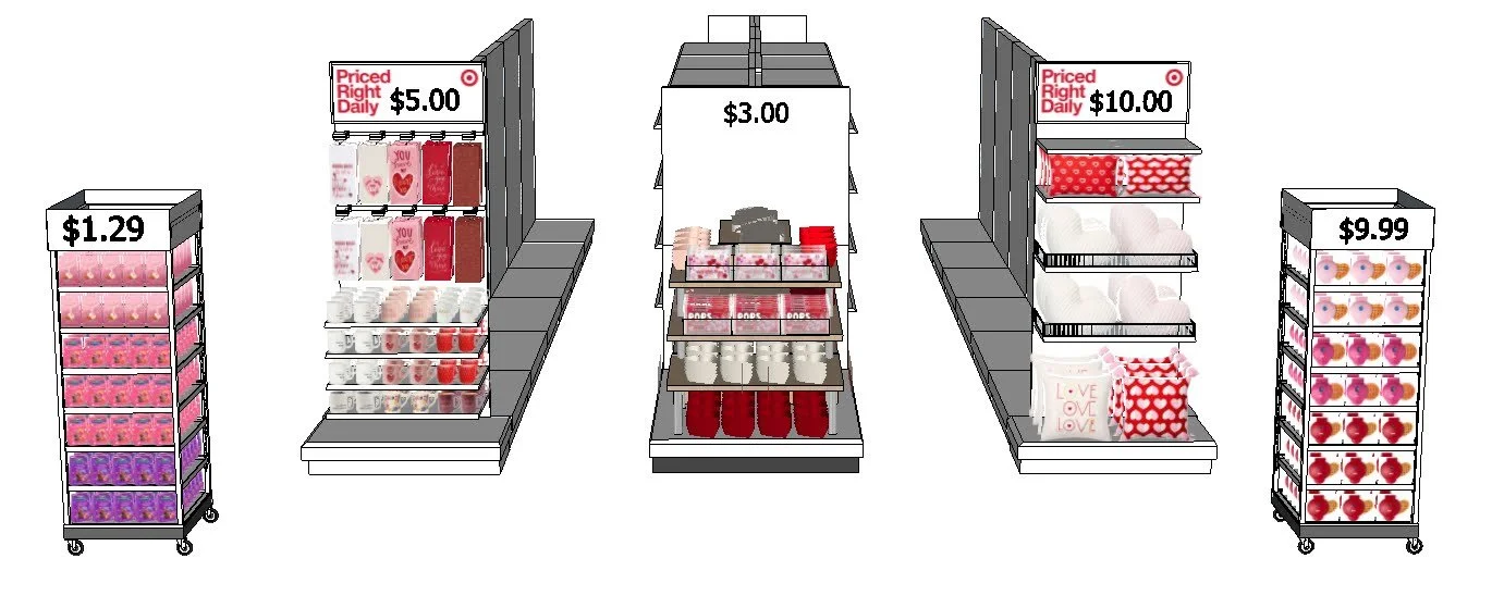
Example 1
Before: Multi (8) PPs
After: SPP (multi-item) Option:

After: SPP (multi-item) Option:
After: DPP Option:


Example 2

Before: Multi (5) PPs
After: SPP (dual-item) Option:
After: DPP Option:


So many ways to simplify to amplify:
Example 3
Before: Multi (5) PPs
After: DPP (multi-item) Option:


After: DPP (3 item) Option:
After: DPP (4) Option:


Example 4
Valentine’s Assortment: Simplified down to 3 SPP Endcap moments

Valentine’s Assortment: Same 3 SPP moments on in-aisle fixtures

Valentine’s Assortment: Same 3 SPP moments on a Focal + flanking Endcaps

Valentine’s Assortment: Expanded to full shop moment with simplified PPs
Valentine’s Assortment: Expanded to full shop moment with simplified PPs, further refined
