
Target // Process + Key Capabilities
Throughout the past 8 years at Target, there have been many side-projects, stretch assignments, + moments where I’ve needed to lean-in to solve problems across my own team, as well as co-solve with other teams, outside of our cyclical work. It always feels good to be tapped as the expert in something, or to be looked at as a reliable + trustworthy team member who others can go to for collaboration, assistance, +/or guidance. Moments like these have helped highlight skills I excel at + capabilities I would say are my strengths. Below are each of those key capabilities with an example for each, starting with ones that tie back to work from my time in Accessories + Apparel, followed by examples from my time in Home + Hardlines.
Organize…
Organizing is a top skill in many different ways. I have a strong attention to detail, and a process-driven mind, that allows me to fully analyze most situations and formulate the best plan of action to proceed with. I tend to use the phrase “cross my Ts and dot my Is” because I do believe it is important to gather all the data and ways-in for a situation to not only make the best approach plan, but also handle it in the most organized way.
…the visual strategy to match merch priorities, and lay out communication of shop architecture.

This is just one example of organizing in action. From my time in A+A for Activewear, it was important to organize the full assortment to plan out the visual strategy, to ensure it aligned with Merch priorities. Once organized by shop/zone (Girls vs. Boys), the assortment was then organized by end-use/collection to determine which trend stories needed to be told from an outfitting perspective vs. what areas of the floorpad needed to stand for category dominance or value statements. The above shows the fully organized assortment arranged utilizing our LADS structure (Lead, Anchor, Destination, + Support) and how each collection or category moment would show-up on the floor + in what zone. This method of organization + planning not only helped gain alignment from cross-functional partners in executional approach + priority placement, but also assisted in overall zoning of the floor. This approach then ultimately improved store team’s comprehension of the zones within each shop and understanding around what spaces were priority for filling + recovery/upkeep.
2. Influence…
Influencing is a skill that can show up in numerous ways. For me personally, I tend to be very inquisitive, always asking clarifying questions + wanting to be as knowledgeable in a business as I can be. In doing this, you tend to learn what things are done “because we’ve always done it this way” and what things are truly new + innovative. Being in a role where you always want to show up on-trend but also fresh and new to the guest, to keep the experience exciting + guests coming back time and time again, unlocking new ways-in is key. With newness comes challenge because it can be uncharted territory or perceived as a scary risk to partners. There is difficulty for some in navigating ambiguity. This is where influencing comes in. Presenting new ideas, or challenges to the status-quo, in a way that is understandable/digestible for all learning types, ensuring what is brought to the table is rooted in knowledge + data to support your case, and proposed with examples to enhance visual comprehension + allow others to see the vision. To pitch an idea with the hopes of buy-in, influence a change or progression forward, you need to be assertive but not forceful.
…to improve merchandising + guest experience, through challenging the status-quo.
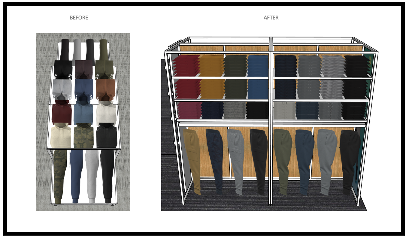
This is a simple, but effective, example of influencing. From my time in A+A for Activewear for Men’s, we had a lot of legacy programming that were tried + true collections the guest knew they could rely on us for, and they had been merchandised the same way for so long, the guest also knew exactly where on the floorpad to find them. During my time on this desk, one of these legacy programs: our 80/20 Cotton Hoodies + Joggers, went through a re-vamp of fabrication and style. In this improvement process, for a better hand-feel + cozier set altogether, remaining on-trend, there was appetite to grow this program: introduce more colorways, more styles/fits, and lean into depth behind the buys in a bigger way. In order to accomplish all of that in-store, we were not going to be able to support the growth needs by merchandising these items on the same fixture we had in the past. In order to suggest a new merchandising solve to the team, I’d need to leverage that influencing skill to get the team onboard with changes to our visual merchandising strategy for us to successfully accomplish the asks. This meant changing floorpad location + fixture usage for these items. I knew I needed to approach this in a way they could follow along with + better understand growth potential, so taking the time to quickly render the new space with the proposed assortment would give the group a visual example to better understand the proposed shift. This render would then showcase the unlock of leveraging a different, more flexible, fixture type and illustrate the variations within hanging + folding product and how that could ebb and flow what we did in the space from an impression and depth standpoint. In this example, we were able to increase capacity behind our top hoodie style, add additional colors behind it, and bring in another top style, for 3 top fits vs. just 2. This exercise then also allowed me to illustrate during the conversation how we can adjust those counts depending on the merch assortment strategy needs: folding down the pants to afford more unique styles or additional colors or even more depth to fit on these fixtures at peak times. Knowing how to illustrate the visual techniques needed to compliment the necessary anticipated dialogue helped influence the team to get behind the shift. Not only did this achieve everything the team wanted to do with assortment changes, it also supported the need for increased capacities while giving flexibility for those needs to ebb and flow, + it provided the guest a refreshed experience for a loved item that made it new again and more dynamic to shop ultimately increasing sales!
3. Elevate…
Elevating a presentation, or the overall guest experience, is very important in the world of visual merchandising. The ability to take everyday items and present them in a way that is awe-inspiring, makes the guest want to touch/feel/explore, entices shoppers to complete the look and build the basket, etc. is at the heart of any good visual presentation. A put together shop that feels elevated draws the guest in + attracts more customers and foot traffic, it is then easier for the guest to shop, meaning it is also easier to find what you’re looking for (or even what you didn’t know you needed/wanted) and usually ends up in closing a sale with a purchase of at least 1 if not more items. Elevating an experience also directly ties back to brand recognition and guest perception, so its imperative to maintain a visual approach that ensures a positive guest experience to keep them coming back time and time again!
…the brand and overall guest experience.
The above is an example from my time in A+A for Activewear, when we were working to launch a new Owned Brand for Target. After navigating the activewear space for a handful of years, the Mens, Women’s, + Kid’s performance spaces evolved in both assortment and merchandising strategies to change as the guest needs changed. In order to fully elevate the shopping experience in these spaces, there were key factors that needed to be analyzed + understood, to make the appropriate shifts in visual approach. Taking into consideration key guest insights for how the guest shops activewear, what attributes they look for first, and understanding the hierarchy of guest purchasing decisions, I was able to pivot my approach to visual planning and ensure each shop was set up to support those guests wants and needs.
Eventually, the company decided it was time to own this space in a more authoritative way and we walked away from our partnership with Hanes on the C9 Champion brand, to invest in a Target Owned Brand instead: All In Motion. The above is just one snapshop of the Mock Store work that was done in those early stages of standing up this brand. In this image you will see the Women’s performance floorpad. My job was to figure out the right balance between clean + overt category destinations and special curated trend/end-use storytelling moments. Essentially where Fashion or “Must Have” impulse items would land vs. the Everyday or “Core” staple items could be bulked-out, and the overall fixture block in the space to achieve this. One of the key successful factors in this brand elevation was allowing the fixture block to showcase both of these moments from the main aisle, so at quick-glance the guest could see we were offering them BOTH core and fashion items. Then from there, once we’ve grabbed their attention, leading in the space with the most exciting fashion and on-trend items to start getting them to explore, touch + feel. It was intentional in this zoning of space to created core destinations for both Leggings + Bras, the top 2 categories for Women’s Performance, where we could bulk-out all style and end-use needs for the guest to see their options holistically, and then have them surround the space to act as clean and authoritative back-drops to the shop. Each of our category destinations were organized in clean + overt ways based on guest shopping behaviors. For leggings, it was by material that correlated to end-use needs (Contour/everyday, Sculpt/active, etc), and within each fabrication was the range of fits. For bras, it was more important to be arranged by support level needs (low, medium, high), then by strap style within those support levels. Both of these destinations were supported with key signage to help navigate and educate the guest on their options, to ensure they could confidently make the right choice for their desired end-use needs! Another key factor in the overall elevation of the space was leveraging + balancing display enhancement options: Mannequins, Bust + Leg Forms, and Displays. Re-inventing the mannequin package to be more inclusive to all guests from both a body-type perspective to an activity-level standpoint. Strategic usage of forms to compliment the guest education of styles and fabrications, while also providing balance throughout the shop where inspiration is trickled throughout.
4. Streamline…
I am a big advocate of growing from learnings and ensuring we are pulse-checking ourselves + our work to ensure we are achieving the goals we set out to. Its one thing to do the work, but if the work doesn’t come to fruition as intended, somethings wrong or there was a miss somewhere, which just means there is room for further improvement! Streamlining is a never-ending process of refinement + ensuring we continue to put our best foot forward for our store teams + the guest.
…processes through hind-sighting + identifying execution opportunities.

When we launched All In Motion, Target’s owned brand for apparel for the full family, the intent was not only to have an in-house activewear brand, but to also create one synergistic guest experience across all of the Performance spaces. With that, the assortment had similarities too, for easy Mommy + me or Dad + kid match-back opportunities. After brand launch, we realized that some of the pieces were SO similar, that store teams were having a hard time easily identifying what gender or age the items were. A Women’s basic black tee looked very similar to a Men’s basic black tee, and the Kid’s size XL was very close at quick-glance to the Adult size XS. Because of this we were having set issues, recovery issues, and stores having items say in-stock but team members having trouble finding them to help guests + fulfill orders. When this issue arose, I knew we needed to reassess and figure out a solve to better streamline how to set for our store teams. As someone who also prides herself in her work, and was feeling very deflated by store teams struggling to set the floorpads as intended, I took this personally even though it wasn’t exactly something I could control or have foreseen being an issue for stores. But, I was determined to figure out a solve that would fix it. I took the initiative to partner with the packaging team so we could add a callout to the hangtags to help teams quickly identify which floorpad an item belonged to. We couldn’t write “Womens”, “Mens”, “Girls”, or “Boys” on the tags for 2 reasons: we wanted to be as inclusive as possible + the whole point of the AIM brand was to be a safe brand for inclusion and cross-shopping, and there was already a lot of text on the hangtags + we have limited character inputs we can submit. So, we ended up coming up with a color-coding system: assigning a specific color to each floorpad. This would allow us to label items “Womens” or “Mens” without using the words guest-facing. This color-coding cheat sheet was then added to the VMG (visual merchandising guide) + trained out to stores so they knew about this quick-reference tool! This packaging partnership + cross-team collaborating to solve the problem and better streamline worked! We got tons of positive feedback from our store teams on how helpful this was to maintain the floorpads + recover the spaces quickly + accurately!
5. Develop…
…connections + brand standards for efficiency, ease, + consistency.
We are only as good as the people + partnerships we have around us and the tools we have to leverage. By taking the time, effort, + energy to develop good relationships, we invest in our network— which in-turn betters the work for all. By taking the time to assess + understand processes + tools, we are better equipped to unlock improvements + identify gaps. Developing connections outside of direct cross-functional team is extremely important in ensuring all aspects of the process are on the same page of enabling innovative presentations to be achieved. By clicking-in further to these relationships, we are able to refine + develop additional tools to be leveraged for improved sets.

With the All In Motion brand launch, we were merchandising products differently than we had in the past, to remain trend-forward, innovative, + gain a higher style perception from the guest for the brand. During the brand launch process, when I went into stores to see set execution + get team member feedback, I was seeing a lot of stores folding their leggings incorrectly. When I asked more questions, I learned that the way the leggings come in shipment (how they are folded in the box) is nowhere close to how they are being directed to set on the salesfloor, and with limited payroll hours, teams did not have the ability to re-fold every single pair of leggings that came in. From this finding, I was able to take this back and dive in deeper into why the items were being shipped in differently and how this could be fixed. I soon learned about the “Floor Ready” team, which was a team VM had not directly worked with prior. This team creates standards for the vendors on how items should be folded for shipping. These standards are called Floor Ready Specs. When I learned this, it was baffling to me that we call these “Floor Ready” specs, but the items come in the farthest thing from “floor ready”. This was when I knew I needed to develop a working relationship with the Floor Ready team + figure out how we integrate them into our working Op model, to ensure we are aligned for items to be shipped in truly floor ready. After developing a good relationship with this team, we then went page by page for all of the Activewear Floor Ready Spec documents (Womens, Mens, Girls, + Boys) to ensure alignment + make adjustments as needed based on how these items would be merchandised on the floorpad in the future + to align with the AIM brand standards of how we want the brand to show up. We ended up needing to develop some new Floor Ready Specs to further differentiate items + make the documents more inclusive of the full assortment of items. Above is just one example of an adjusted Floor Ready Spec page where we changed how Leggings were being shipped into stores, so that it was easier + more efficient for team members to get shipment to the floor and match the VMG direction without having to waste payroll hours re-folding every item. All in all this was a HUGE win!
6. Optimize…
One of my main roles as a Visual Merchandiser is to optimize a space. If we are underutilizing a fixture or shop, we are risking losing sales and potentially leaving money on the table. When a fixture is being used to the best of its ability, we are maximizing the merchandisable space, and in-turn we are maximizing number of units we can sell + profit to be made.
…assortment capacities + overall potential, to increase total brand sales.

When the Visual Merchandising team was first created for Target, there were no capacity deep-dives done prior by other teams, which meant there was not a full understanding of space maximization by the Merchant teams buying into the space. Everyone was operating off of the previous year or guesstimating. This left a lot of opportunity on the table. When VM got involved, one of the first things we did was a capacity deep-dive study to understand multiple things about Target’s floorpads: the different fixtures + hardware options we have to leverage, the many different hanger type variations, and the range of different silhouette + fabrication styles we’d see over the course of a year through various seasons. The reason this study was important was because it provided us data to help us teach and train our partners on overall space maximization. Testing out each item type and hanger type on each piece of hardware allowed us to have visual examples and accurate capacity numbers to communicate. For example: a Men’s activewear T-shirt, on a normal top hanger, could fit 25 units on 1 faceout bar, but a Men’s activewear medium weight Jacket, on an outerwear hanger, could fit 3 units comfortably and 5 units at absolute maximum. That example showcases how assorting 1 for 1 from season to season does not equate… that you may only need 1 faceout for all units of the T-shirt to fit out on the floor, but the Jacket may need 3 faceouts for one color or a 4ft sidehang bar instead. Once we had this data compiled we could run numbers, based on typical merchandising/hardware usage in the space, to see the average number of units we could fit per fixture + then calculate the average units for a total shop to truly optimize the space we had to merchandise in. This helped guide our Merchant partners with their overall assortments, understanding fit + trade-offs, and right-sizing their buys. We then took this work one-step further, to what was called “Store Grading”. Knowing that not all stores would need max capacity inventory investments, we did an exercise to illustrate what a max capacity fixturing would look like vs. an average capacity fixturing vs. a minimal capacity fixturing. Then we re-ran the numbers to show the variation in number of units each could hold. This translated to Low Volume investment, Average investment, + High Volume investment. The SPT team could then apply this to each Target store and identify what Store Grading bucket each store fell within. The Visual team could then create standards and fixture hardwaring fluctuation tools to help store teams understand how to adjust hardware based on volume needs from Low to Average to High. We then adjusted the rack allocations by store to right-size what number of racks landed in each shop based on the Volume designation of that store’s specific shop. The High Volume stores were considered Store Grade 1 doors and would receive the higher inventory investment, and higher rack counts. Those store teams would then set fixtures with the High Capacity hardware guardrails to allow them to fully maximize their space and fit all the inventory they received onto the floor appropriately. In-turn this fixture, shop, + store optimization work, through the capacity deep dive and Store Grading exercises, allowed for better inventory allocations, floorpad space optimizations, + improved sales profits!
7. Explore…
Retail is a highly competitive market full of ever-changing trends and rotating seasonal amplification needs. Guests have so many places they can choose to shop + spend their money. Because of this, its imperative to continue exploring ways to stay ahead of the trends + create new experiences for guests, to remain competitive + constantly gain new guests. This exploration can come in a variety of forms, from looking at assortment components differently and curating a new narrative, to influencing additional assortment pieces that could add to a specific trend narrative, or even exploring new ways to highlight products, merchandise a space, leverage a fixture, or compliment a presentation via SEM (store experience marketing). By exploring new ways to story-tell, exploring new trends to stand for, and exploring capsule ideas to highlight, we can gain new guests, keep old guests coming back, and ensure our brands are on-trend + leading in the market.
…new ways-in to stay relevant in the market + attract new guests.

The above example is one of my favorite explorations during my time on the Hearth + Hand brand. We leaned into the Front of the House fixture as our gateway to the shop, and leveraged this fixture as our on-trend + seasonal storytelling space. This fixture ended up going through a few strategy changes, and we eventually got to a place where we would update this zone more frequently to stay more relevant, tell more curations, + ensure the lead in to the space was full + impactful. The example above is from our C5 / Fall cycle set. The team was really into nostalgic pieces with vintage inspiration. They designed a few lounge-esque pieces, and there were a handful of music inspired pieces as well. The combination of these key pieces was where the idea of a “Listening Lounge” came from. I took this concept and ran with it, exploring what elements make up a listening lounge, how those types of spaces look + feel, and understanding how we could get this narrative across to the guest. In this exploration, I realized that we had a lot of the elements that would make up a Listening Lounge, in theory, but what is a space revolved around music… without any actual music. I concepted out what we needed for the space, as shown above with the inspirational swipe + my notes for further explores in merchandising. But what was missing was the sound element to round-out the story-telling, and loop in another one of the guest’s senses. Unfortunately, we didn’t have the ability have get actual music playing in the Hearth + Hand shops in all stores on this timeline… so it would have to be a music interjection in another way. After bringing this thought back to the team, I looked into partnership with the Music team to understand how we could make something work. This explore then created an amazing reality that I am SO proud of! We were able to make a Limited Edition Vinyl Record, of all of Joanna Gaine’s hand-picked favorite songs, to be an Only @ Target release, to set with this Listening Lounge set + give us that missing music element. We were able to merchandise this record with the record player and the record stand to be the exclamation point on this story-telling narrative! What is not shown in the above image what the SEM creative work we then partnered with the team to create showcasing Jo in an actual Listening Lounge to further clarify to the guest what the narrative was. Then, we took this explore one step further. Knowing in-store we can only do so much without big furniture + displays, so we initiated a collaboration with the SEM team to also provide a QR code on the signage, that would direct guests to the .com experience where the full Listening Lounge assortment was available with additional inspirational imagery to further back the story narrative for the guest! All in all this was a massively successful explore, that did in fact provide a new take on the space for the existing H+H guest, attracted new guests to the brand, + positively increased sales!
8. Lead…
I always knew I’d make a good leader, and I felt very successful in that role during my time with Charlotte Russe + Tommy Hilfiger. However, at Target, it is a lot harder to lead when you either are not in a leadership role, or its not your project to take the lead on. Luckily, I was given a handful of opportunities during my time at Target to get to lead a variety of initiatives to better the overall guest experience, our internal processes, overall operations, + evolve initiatives from years past!
…large brand initiatives, with multiple complexities, to reimagine the guest experience .

The above example is from the HI Flat + Mini Seasonal Back-to-College timeframe. I worked on the Back-to-College set multiple years in a row. In doing that, I knew all of the tiering complexities really well, all of the space limitations we had to navigate, and where we had been in assortment, depths, and overall merchandising for the previous couple years. This knowledge gave me an edge to better lead + guide this project further out of the team’s comfort zone by proposing shifts that would differentiate the space from years past, but still accommodate the necessary inventory investments, key item bulk-out requirements to meet sales needs, + provide a good balance of meeting expectation/wants from the team but also challenging them to explore differently + dream bigger. I lead all of the conceptual work for the Mini Seasonal Tier 2 + 3 spaces, diving into capacity studies to prove out this shift in merchandising approach would still hit the needed unit counts per items, and I lead those space negotiation conversations with the team for them to understand the tradeoffs per zone. In leading this work, I was able to successfully illustrate + debunk any concerns with this approach shift + provide visuals that got the team excited about setting by room aesthetic to better help inspire our guest to build their perfect dorm room (+ build the basket)!
9. Challenge the Status-Quo…
…by thinking bigger than current day-to-day restrictions of the work .
This is one I am no stranger to. As I’ve mentioned previously, I am a very inquisitive individual. I always want to know all the facts + become the expert in the business I support. To become the expert you have to get comfortable asking questions… but also challenging the answers to those questions, to ensure full understanding + get a grasp on when something is a real reason for doing something or just what we’ve always done. Challenging the status quo means not being afraid to step outside of the box, bring to the table an idea that may be turned down or may be percieved as risky, but bringing it to the table anyway. Challenging the status quo is pushing for innovation + dreaming bigger.


Above is my favorite example of when challenging the status quo was successful + worked to truly create something magical! For the Disney X Pillowfort brand collaboration launch, we were going to have 2 different stories to tell: Disney Princesses + Marvel Superheroes. While both of these are cohesive in the fact that they would be in the Pillowfort aesthetic, they were still 2 very different stories, with a lot of different characters + item types to accommodate. In-order to make the in-store experience the best representation of the many item types the team was bringing to the table for our guest, and to get credit for the range of characters + inclusivity options— we needed more space in-store to do this collab justice. Prior to this, the team had been operating very rhythmical in setting similar to years past, where 1 submission item landed on 1 asset. If we were to go that same route here, all of the product shown above would have needed to land on just 1 of those tables. Which means, we wouldn’t have been able to even tell the 2 different stories in-store, nevermind have character or item type variety. Prior to this set, I had brought to the table the idea of planning our space differently where 1 story could span multiple assets, but each time I brought it up it fell through, and we continued to do 1 story per 1 asset. BUT, this time, I was able to partner more in-depth with SPT + map out what this translation of a shop-in-shop Disney moment could look like, and what that could mean for other programs being displaced. Bringing to the table visuals and data, as well as the problems to be solved to make it happen, better allowed me to challenge the status quo here + gain buy-in from the merch team to explore this way in! Ultimately we aligned to take over multiple assets to best tell a full Princess + full Marvel projection in as many stores as we could! Then, through further partnership with SPT, we clicked into our other prototype version to understand what fixture limitations we had + what that meant for the assortment, to segment our approach and provide the best experience we could by prototype for guests to get as similar of an experience as possible. All in all this brand launch was amazing + guests responded well to it! Challenging the status quo here unlocked new ways of working, new understandings of our space + version segmentations that ultimately allowed us to apply to future builds and get more exploratory with how story-telling can show up in this space! Big win!
10. Partner…
…well, consistently, and in new ways, to unlock storytelling possibilities.
I’ve said it before, and I’ll say it again: we are only as good as the people + partnerships around us. Building relationships, being a good thought partner, challenging each other to think differently, + being open to collaboration are the ways to win. If you cannot connect with people, ideate + concept together, try to debunk ideas + plans together, and come to a resolve or solution with others, then there won’t be any positive progress forward. The best ideas come from partnering with others to help make them a reality!

The above example was from my time on the Kitchen team. In previous cycles I had partnered with SPT to understand our other assets, segmentation limitations, door count fluctuations, etc. This information gain helped me better understand what we can and cannot do with respect to storytelling bigger + across more assets. There had been a few cycles where I proposed storytelling in this space be bigger than 1 idea per 1 asset, and each time the idea fell through due to team hesitation of perceived risk and fear of change. For pre-back-to-college in 2025, I was finally able to influence appropriately + challenge the status quo with enough facts + data, supported by visuals, to get the team to align on shifting PolyPro (example in the next bullet below) off of the Focal fixture and onto 2 Endcaps. Because. of this win, it unlocked the Focal fixture for the Back-to-College timeframe. The Design team was mirroring what the HI Flat team was doing + designing all the items, across multiple submissions, to work with in 3-4 color stories/room aesthetics. Because all of these submissions had all color stories represented, it became the perfect assortment to illustrate to the team the power + impact we could create by storytelling across multiple assets. I was able to partner with SPT to best map out what this color explosion approach could look like + what that would mean to the other submission items. I then sketched out a rough idea of the repetition in presentation for each of the color aesthetic moments as well as the ease this would create for the guest to shop by their dorm room aesthetic + get a one-stop-shop on a couple fixtures vs. having to walk around all over the place searching for what they need: better build the basket. This approach also allowed us to still stand for and scream value across the main racetrack — it was a win win! Because of the successful partnership + planning in the up-front work, we were able to get the merch team’s buy-in on this approach! (unfortunately however this set did not come to fruition in stores due to leadership changing the strategy late in the timeline, breaking this plan up entirely… but still proud of the partnership work done here + the possibilities it unlocked for future storytelling in this space!)
11. Right-size…
Right-sizing is similar to what I wrote above for Optimizing. Ultimately, right-sizing assortments, capacities, + presentations benefits everyone: creates a better guest experience, its easier to shop, allows for presentations to be better in-stock, and maximize sales, and ultimately look cleaner + nicer, with is pleasant to set , walk by, shop, + enjoy. Right-sizing is essentially optimizing: making sure capacities make sense for the sales need + are supported by the right fixture type or fixture accessories. This adjustment has great potential to also positively impact sales, which is a no-brainer win!
…assortments/capacities/presentations by clicking into actual needs of the business.


The above example is from my time on the Kitchen business. As mentioned above, and on the Kitchen page, I had been trying to right-size + optimize the Polypro assortment for years. The team had been setting this bulked-out cheap product on a Focal fixture year after year. The Focal fixture had set in place shelf heights, limited flexibility, and when set with PolyPro just became an explosion of plastic that was uninspiring. As mentioned on my Side Projects page, I was a part of a Sprint Project that helped unlock ways of showing Merchant partners + Leaders new ways to look at our assets. This work ultimately lead to Target as a whole pivoting to Endcaps being leveraged as Value moments to scream Single + Dual Price Point statements, whereas the Focal fixtures were the spaces to tell more curated stories + must-have multi-price point trend moments. This project worked to my benefit in proving my point even further with the Polypro assortment. I clicked in further to the assortment and capacity needs + rendered out what it would mean if PolyPro lived on Endcaps instead of 1 Focal. I rendered out multiple ways this could work and then crunched the numbers. All of my examples hit the needed capacities, and then some, and in almost all of my version builds we were actually gaining depth to the buys that could be supported if we made the shift. At first the team did not believe the numbers I was giving them because of the drastic lift that could be achieved. But after showing them the renders and illustrating that Endcaps have movable shelf heights which allows us to right-size the shelf positions to our set needs, and provides stores the needed flexibility to adjust the presentation if the get an influx in certain silhouettes or if sell-through occurs, that visual exploration + representation helped immensely. Ultimately I got the buy-in from the team to make the shift in slotting, and that freed up the Focal fixture for other storytelling explores. In the process, we right-sized the Polypro assortment + optimized sales potential. We were able to increase capacity, add additional color options for the guest, and we still have sell through and space to play with, providing additional learnings that can be applied to even further right-size this next year!
12. Enhance…
Similar to right-size, is enhance.. because it is similar to optimize. All 3 go hand in hand. Enhancing a presentation is making the right decisions needed to present the product at its best. Enhancing a presentation is also making sure to advocate for the right packaging, containment, etc so item types are represented in a way that not only maximizes capacity potential, but improves guest experience and shopability of the product. The goal is to make the shopping experience easier and intuitive for the guest, not overwhelming, stressful, or hard. Enhancing is adding ease while elevating!
…guest experience by advocating for the right fixture use based on assortment needs.

The above is another example from my time on the Kitchen team. The images show the Holiday Wondershop Baking assortment, previously known as “Make, Bake, + Take” — the idea that this collection provides you with everything you need to make + bake holiday goodies + gift them or take them to-go somewhere. Due to the nature of this assortment, there are a lot of little item types. In years past, this was set on a Focal fixture, due to the storytelling / curation nature of what "Make, Bake, + Take” was… however, you can see from the in-store image above, it consistently executed horribly… again to the nature of it being so many little items with high capacity needs due to big sales dollar expectations, + high guest touch. I had been trying since joining the Kitchen team to better enhance this presentation potential by suggesting the shift of this story off of the Focal and onto Endcaps. However, each time it was brought up it was turned down because the team was used to 1 submission landing on 1 asset… so the fact that this story needed to take up 2 assets, that translated to losing a submission line item to them, even though that did not actually need to be the case. Being told no does not stop me from trying, especially when I believe in something + the potential a shift like this could make. So again, I brought this idea up for the 3rd year in a row. I was feeling optimistic based on the positive traction we had made with Polypro coming off the Focal in C4, as well as the positive shift we unlocked in C4 for Kid’s Pillowfort Disney collab… so I was hopeful! I approached this conversation similarly to those other 2, in that I partnered with SPT, and came to the table with more visuals to help the conversations. Rendering out what storytelling could look like for this assortment on 2 Endcaps, and how clean and clear it was, while still hitting the expected capacity needs. Then leaning into the other submissions and talking through what submissions work well together to become a worthy Focal story, to prove out submission line items would not need to be dropped to accommodate this shift. The enhancement to not only the Wondershop Baking assortment, but also enhancing the overall guest experience across total Kitchen was what gained the buy-in from the team on this one to see this shift finally come to fruition as well! Another big win!