Target // Apparel
When I first joined Target in 2017, I was on the Men’s team. At the start I was over a handful of categories within Mens including: C9 (performance activewear), License, Lounge, Basics, and Big + Tall. The goal at that time was to stand-up the Visual capability, as Target did not have a Visual Merchandising team prior to this. My role was to look at each of these businesses + lean into how we could improve the guest experience for these spaces through the use of Visual Merchandising techniques. Our team came up with new fixture development + packages for remodel stores, mannequin molds, floorplan fixture blocks that were no longer the gridded sea of racks Target had been setting prior, cross-merchandising opportunities to compliment storytelling and build the basket, and where we’d leverage displays and mannequin styling. From there, we would partner with cross-functional teams and develop the cyclical strategies of how to bring these floorpads to life/lean into trends/ maximize capacities, fully merchandise these spaces, adapt these merchandising strategies to a variation of multiple different store prototype maps + configurations, create the VMGs (Visual Merchandising Guides), teach + train store teams on how to leverage the VMG + execute each space based on their store-specific layouts, and perform hind-sighting on each set to learn from what was working + what was not.
Within these ownership categories, I worked on a handful of efficiency focused projects, as well, such as: developing proper hang/fold presentation standards for Loungewear; the Basics Reinvent Initiative to introduce torso/partial leg forms into the space to display product while also reimagining presentation needs to better hit capacity goals; Basics Corrugate Reduction work to eliminate excessive amounts of incremental basics shippers at Holiday + solve for increased sku needs and capacities for peak season; C9 reinvent to introduce different mannequin + bust-forms into the space to help amplify storytelling; and the Big + Tall explore where we created a unique presentation strategy for this incremental select-store assortment and how to leverage our fixtures differently to accommodate these larger scaled products to fit + feel right in the space. During my time on the Men’s team, I was also tapped to help with the other categories + brands. I was able to help with 2 main brand launches: Men’s Goodfellow & Co. (main Men’s apparel owned brand focused on everyday apparel) + Original Use (secondary Men’s apparel owned brand focused on a younger generation and more street-style influenced).
In addition to Men’s apparel, there were many times when I was tapped to stretch into other areas, to help the team based on bandwidth, + ensure projects were being completed on time. These stretch projects and incremental work asks allowed me to work with additional Target brands such as: Kid’s Cat + Jack and Art Class, NIT (Newborn, Infant, + Toddler) Cat + Jack and Cloud Island, and Women’s A New Day, Universal Thread, Wild Fable, and Intimates + Hosiery. Usually this work was either helping with cyclical builds, seasonal amplifications, or leading Holiday pop-up moments like Mother’s Day, Back-to-School, etc.
Below you will see some examples of my early work with Target. I was not able to recover all examples mentioned above, due to data expirations on my Target laptop lapsing. However, you will see some work from the Goodfellow & Co. brand launch, the Original Use brand launch, + a little bit of Men’s Basics work. The Men’s C9 examples can be found on the Target Activewear page!
Men’s Goodfellow…
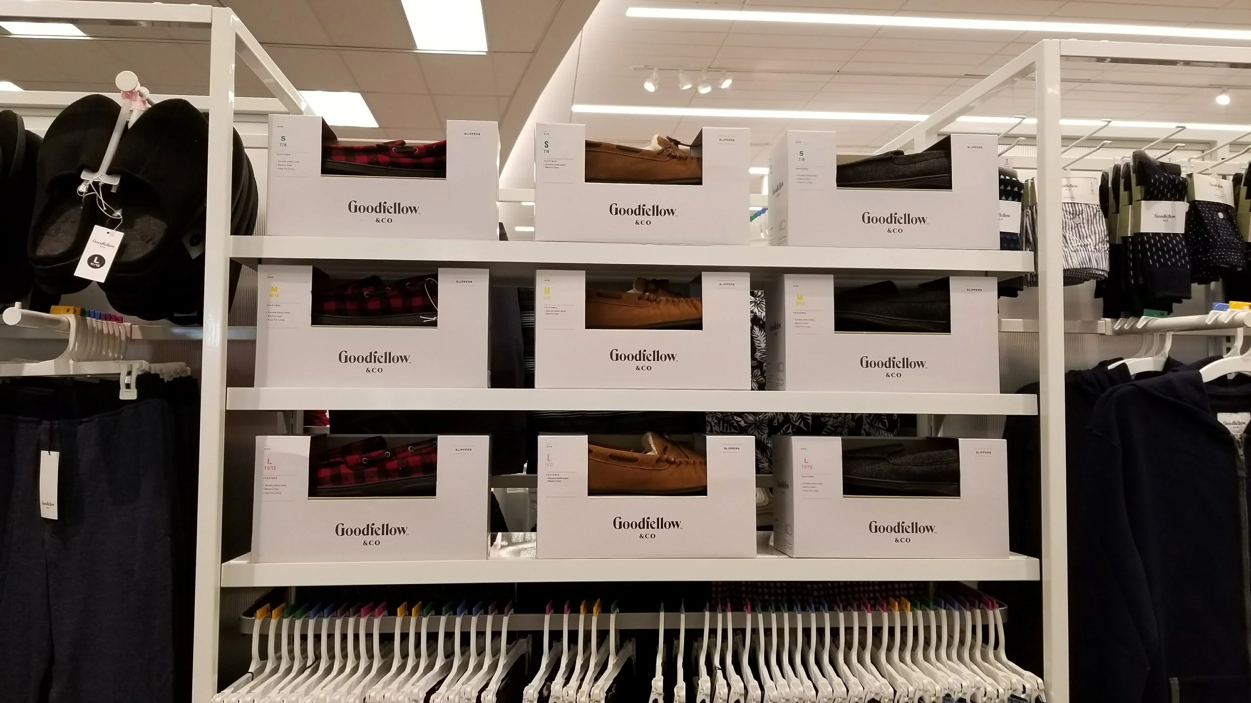
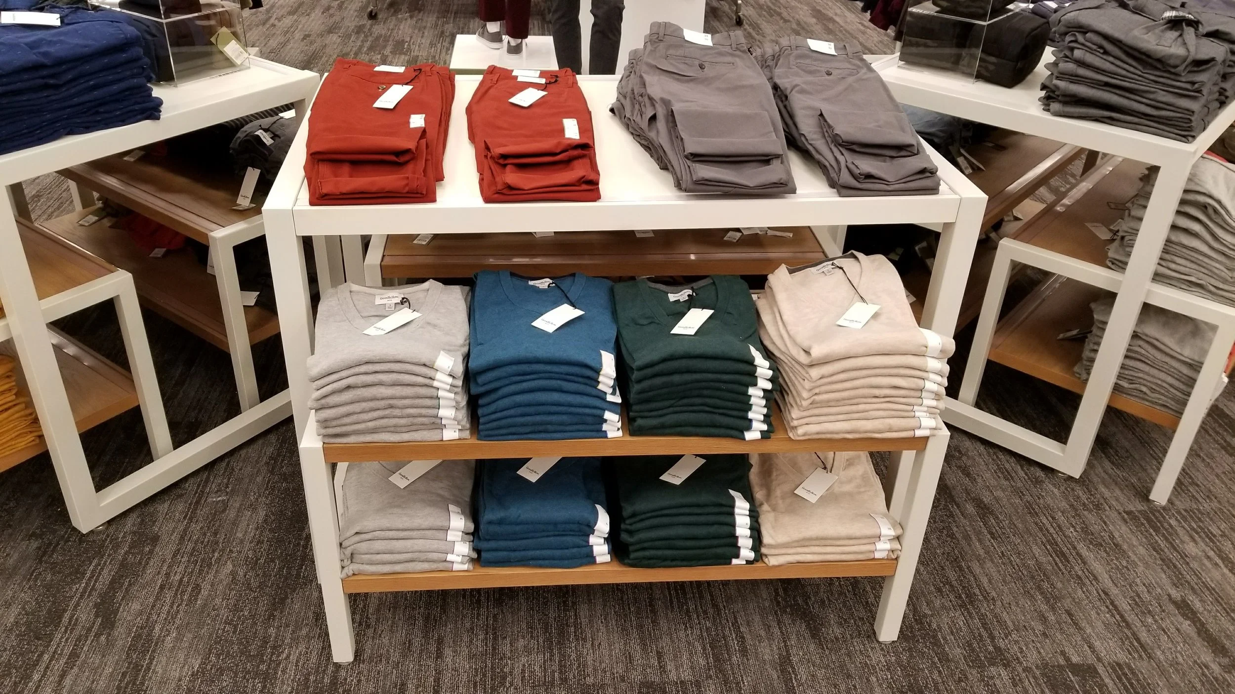
When Visual Merchandising for Target was first stood up, we only had one small room at HQ to set samples of items live + test out merchandising presentations. With so many floorpads and brands to accommodate in that one space, there were many times we needed to go into stores and play around with existing product to refine what the Goodfellow & Co brand launch experience should be. Below you will see some examples of those first store visits, testing out merchandising techniques, form usage, pant fold styles, + the use of cross-merchandising in the space.
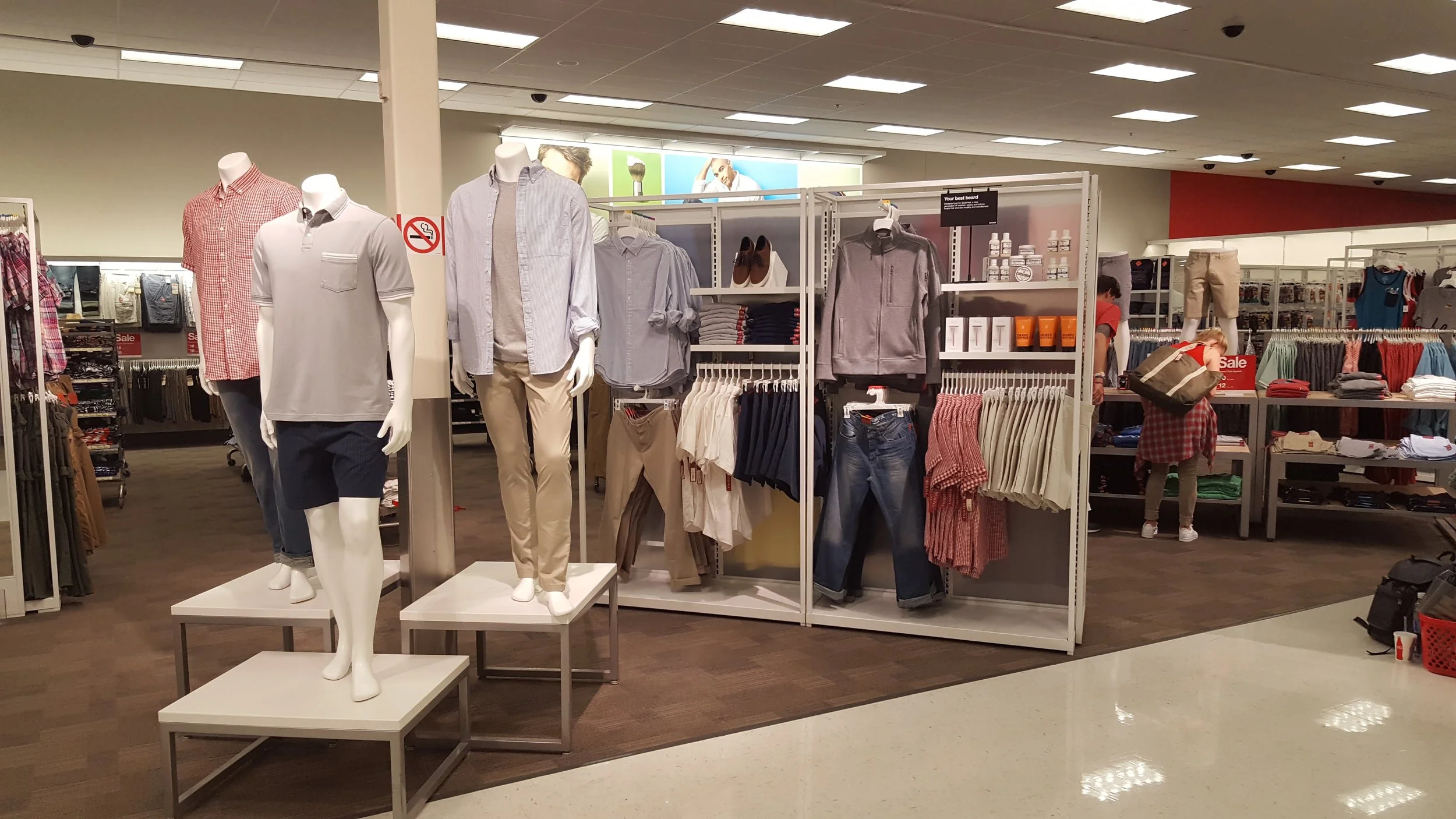


After the initial launch of the brand, we then visited multiple local store locations + helped teams set to the VMG. These exercises helped us teach + train Visual Merchandising to the field, allowed us to build relationships with stores, and helped the MN market understand the VMG is just a guide/starting point and you may need to make adjustments based on store-specific architecture limitations. These interactions also helped us better understand where our field teams were at in their Visual Merchandising education journey and gave us great insights into what other information + tools we would need to provide teams for them to be as successful as possible.

Downtown MN Target:


Roseville, MN Target:


Around the same time of the Goodfellow & Co. brand launch, the Visual Merchandising team + Target as a whole were exploring a new Store Design layout known as the “Next Gen” prototype. This new format of stores came with different floorpad sizes + shapes, different fixture packages, inclusive mannequin figures/forms, and in-aisle “Nodes” that created disruptive storytelling moment possibilities for amplification + excitement. The first Next Gen prototype to rollout was Grand Parkway in Richmond, Texas. We flew down there to set this store for the grand opening. At that time, we were also able to adapt the VMG direction that had been built, to how it should be for that store-specific prototype, helping us better refine our VMG map versions + ensure we were accommodating the unique needs of this store layout in our merchandising concepting + strategy work!

Grand Parkway, TX Target:


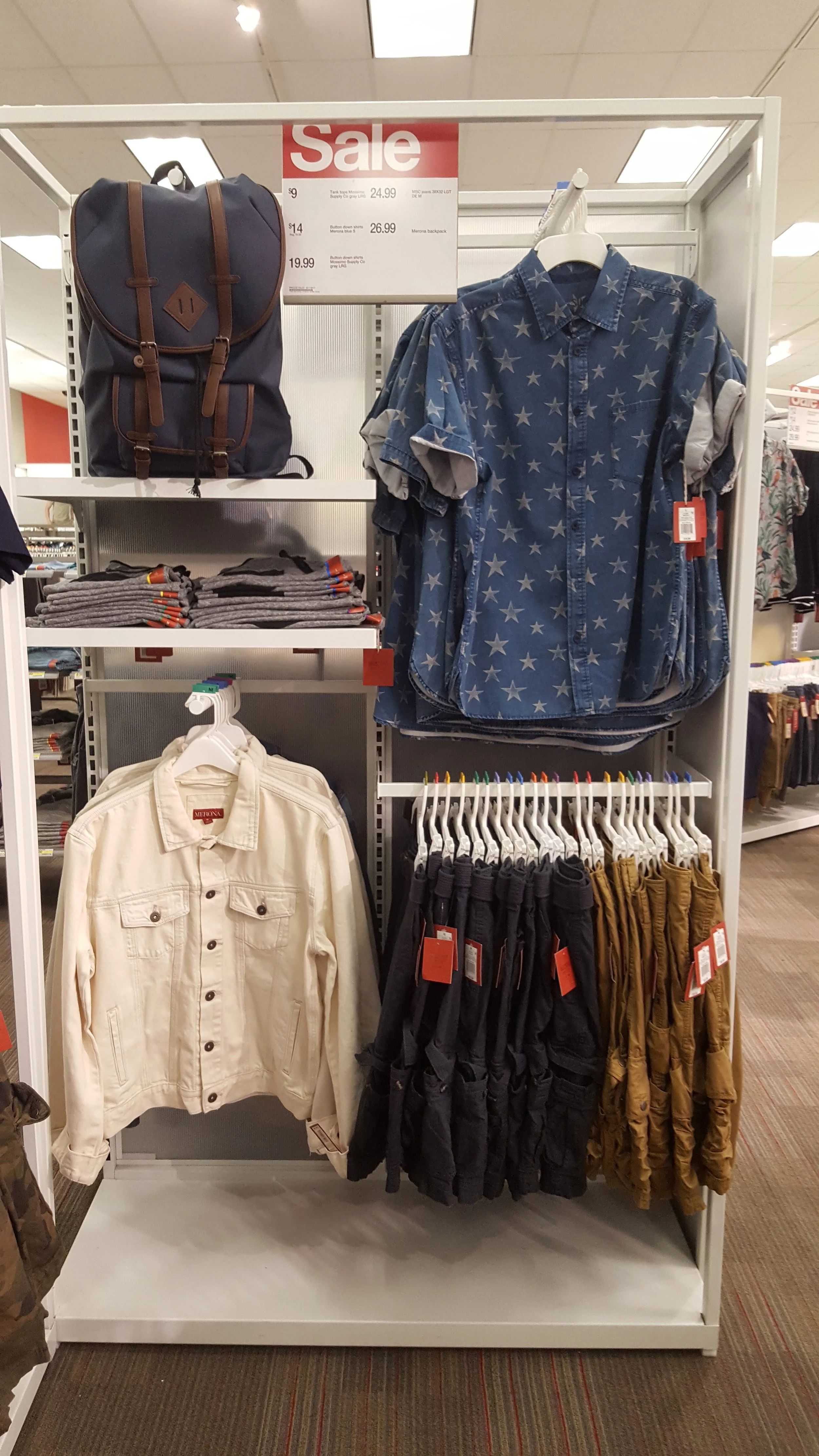
Other Goodfellow: Fall Refresh:
Men’s Original Use …
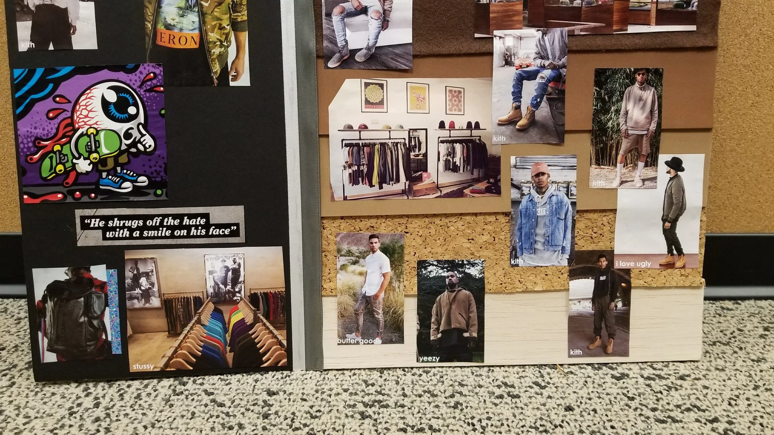
Not long after Goodfellow & Co. launched as Target’s main owned brand for Men’s, focusing on everyday wear + wardrobe essentials, a gap in the assortment offering was identified. While the Goodfellow assortment provides a lot of basic staples like jeans, chinos, woven button ups, polos, + basic tees, it did not accommodate the on-trend more fashion-forward styling of the younger generations. This is where a new owned brand idea was created, and eventually became known as Original Use.
I was able to work collectively with my Men’s team counter-parts to ideate what this brand’s merchandising experience should entail and how we should treat the fixture usage and visual merchandising differently to speak to that younger guest more appropriately. Below you will see some of the behind the scenes up-front work: from when I pulled together a trend-board for what the vision of this brand would look like, to the first in-store set-up of fixture usage testing. Unfortunately I do not have any images from the actual launch of the brand with final SEM, but the project itself went through many iterations to get the idea, presentation, + store team training tools just right. The image below is just that first fixture test phase: playing around with bridging moveable walls together with shelved to create more merchandisable space + a display area that has a boutique feel, and leaving empty space at the top for an amplified SEM space to explore branding inspiration + communicate lifestyle styling.


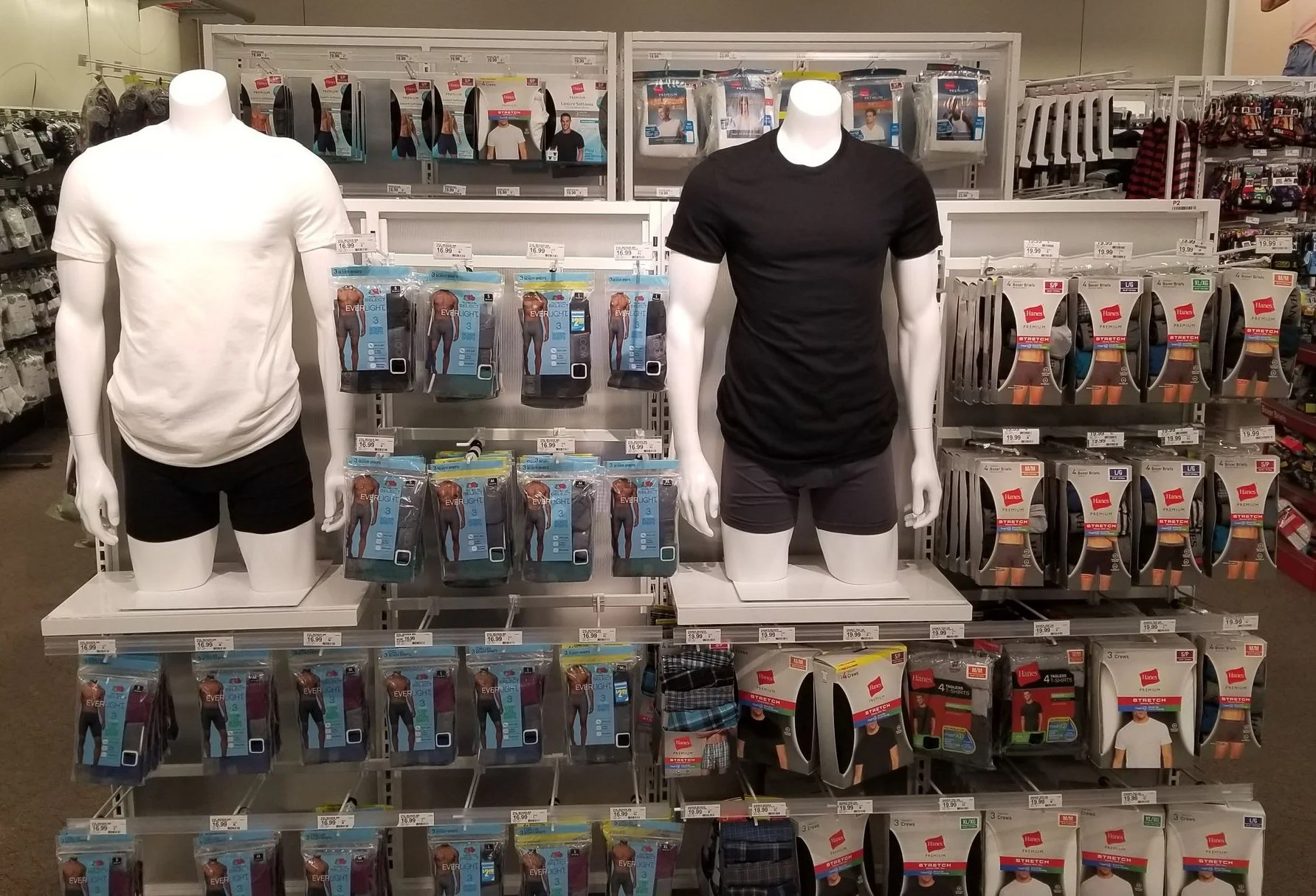
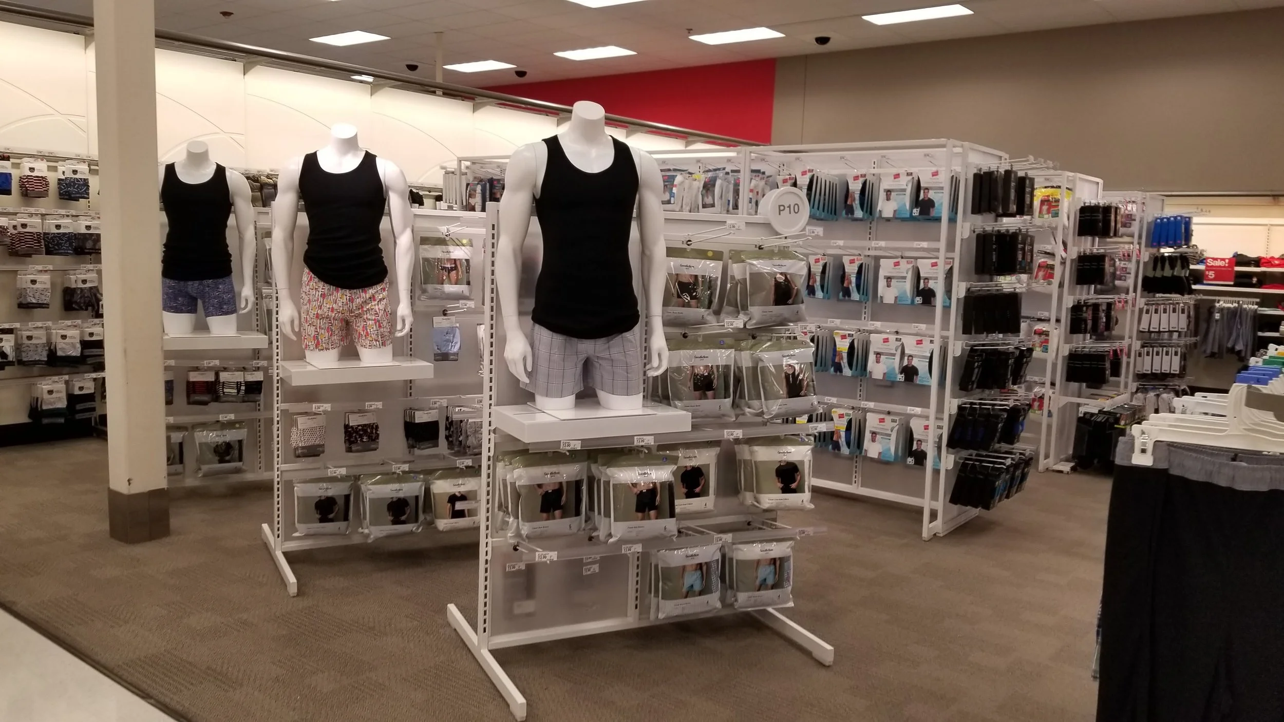
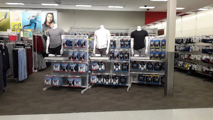
Men’s Basics …
The work within the Men’s Basics world was a lot of partnership with SPT (Space Presentation Team) who own all things adjacencies + POG building. This partnership entailed influencing merchandising flow to transition the space from solely item-focused merchandising with mixed brands in every section, to cleaning up the guest shopping experience and National Brand supporting SEM callouts, by flowing the space by brand first + item type second. In addition, this work explored subtle adjusts to the fixture blocking to add some interest + depth to the space, while leading with a more approachable entrance to the shop vs. a straight-on intimidating barricade. This exploration played around with angling fixtures both as a connected single wall unit, and spreading these angled walls apart to allow for pass-through shopping. This work also included introducing forms into the space to help highlight new + noteworthy products and help guests better understand fabrications + fit. The below images are just examples of these explores, not the final results or the final styling and SEM elements.


Men’s Lounge …
This was another space where we really needed to gain trust with partners that Visual Merchandising is more than just making things look nice, + get them to understand it is a balance of art and science. Mainly focused on getting partners to understand that the goal is to maximize the presentation potential, in turn positively impacting overall sales. When something is better to look at, makes shopping easy by pairing complimentary items together, + can fit more units out on the floor, guests are more inclined and physically able to buy more. Loungewear at Target was always a lower on the totem-pole area from a focus perspective, and had been a rinse + repeat model for years. Coming into this business, I focused heavily on capacity work + illustrating how different hang and fold techniques to positively improve what can fit on a fixture, while not sacrificing presentation or storytelling. In addition to this work, diving into those item-type compliments to have impulse/ build-the-basket moments, i.e. cross-merch opportunities, to improve overall penetration of the department and improve metrics. Minimal images available of this work, however, below shows one of the cross-merch explores. This was before we were able to convince the team that sending in lounge pants still hanging, but half folded near the knee, would allow for double the capacity on the floor.